99U Conference :: Branding Collateral 2013
99U Conference 2013 Branding Collateral
99U Conference Branding 2013
—
—
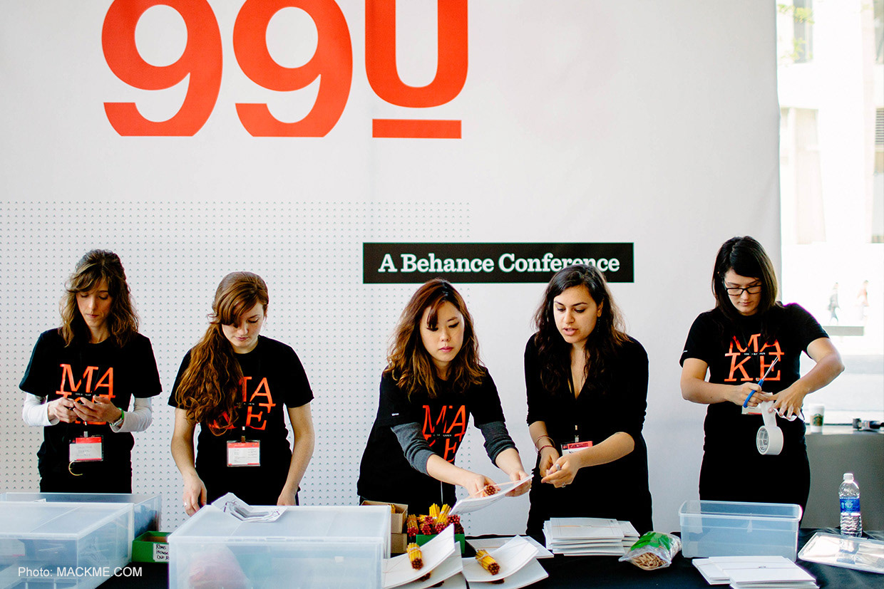
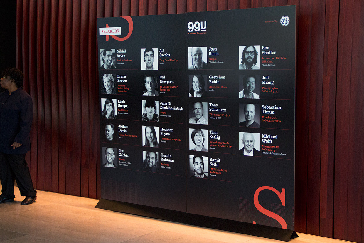
All of the 99U Conference materials get re-imagined and re-designed by the Behance Team every year, and 2013 was no different.
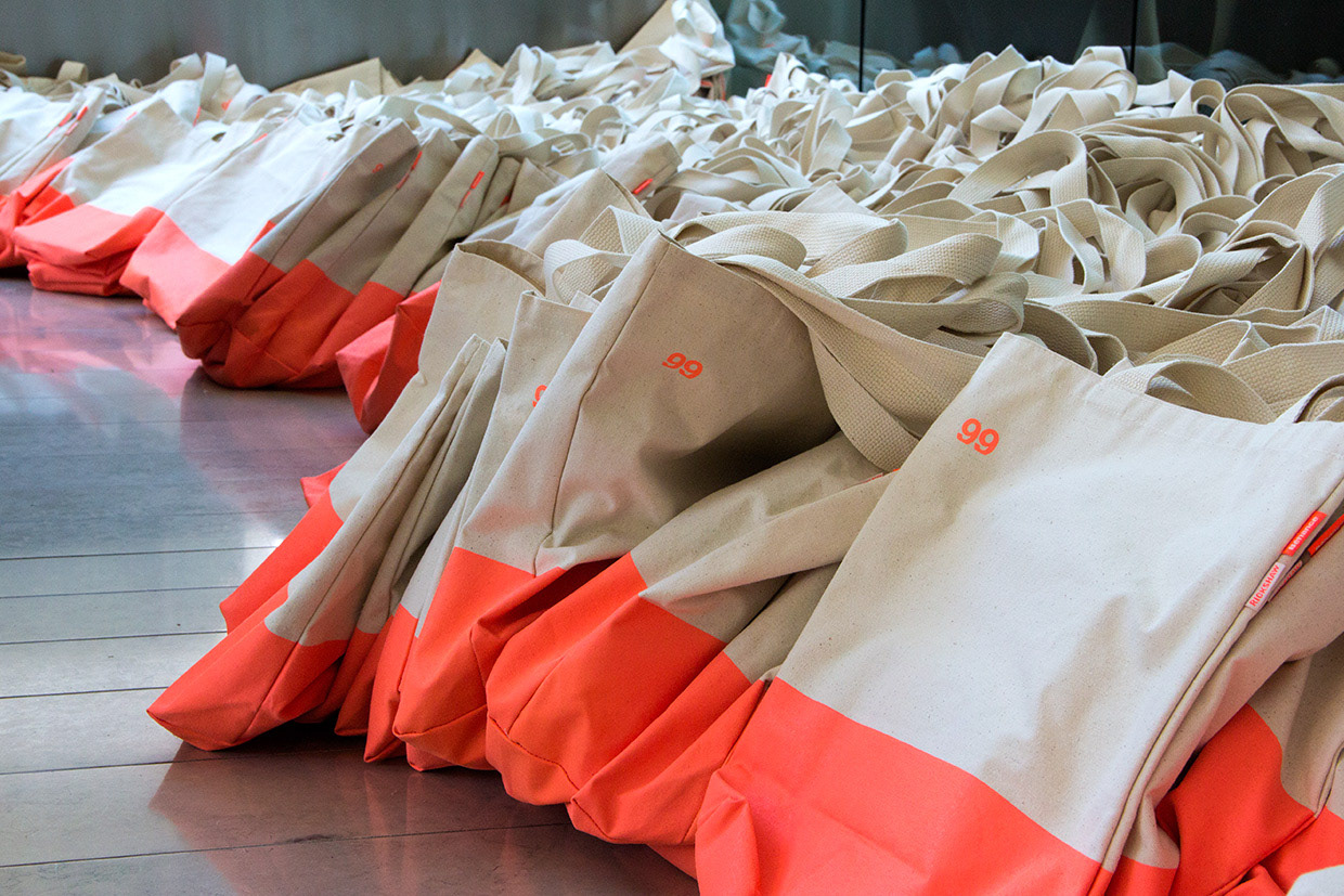
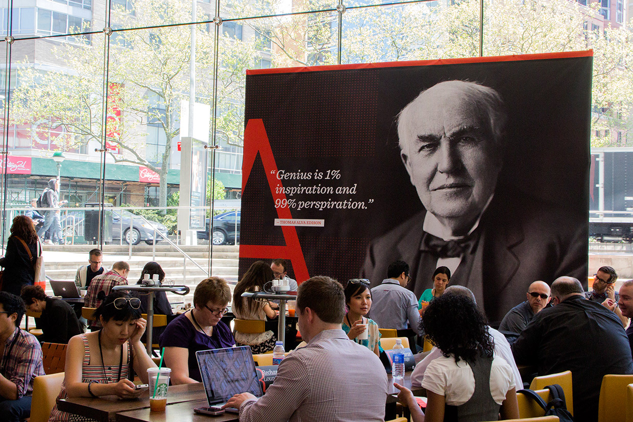
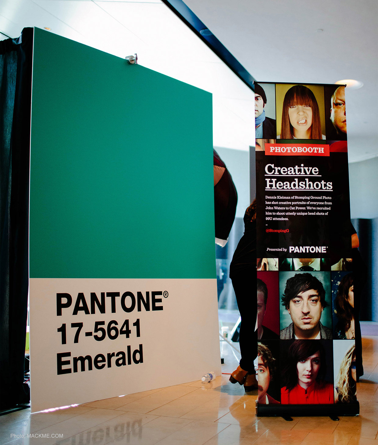
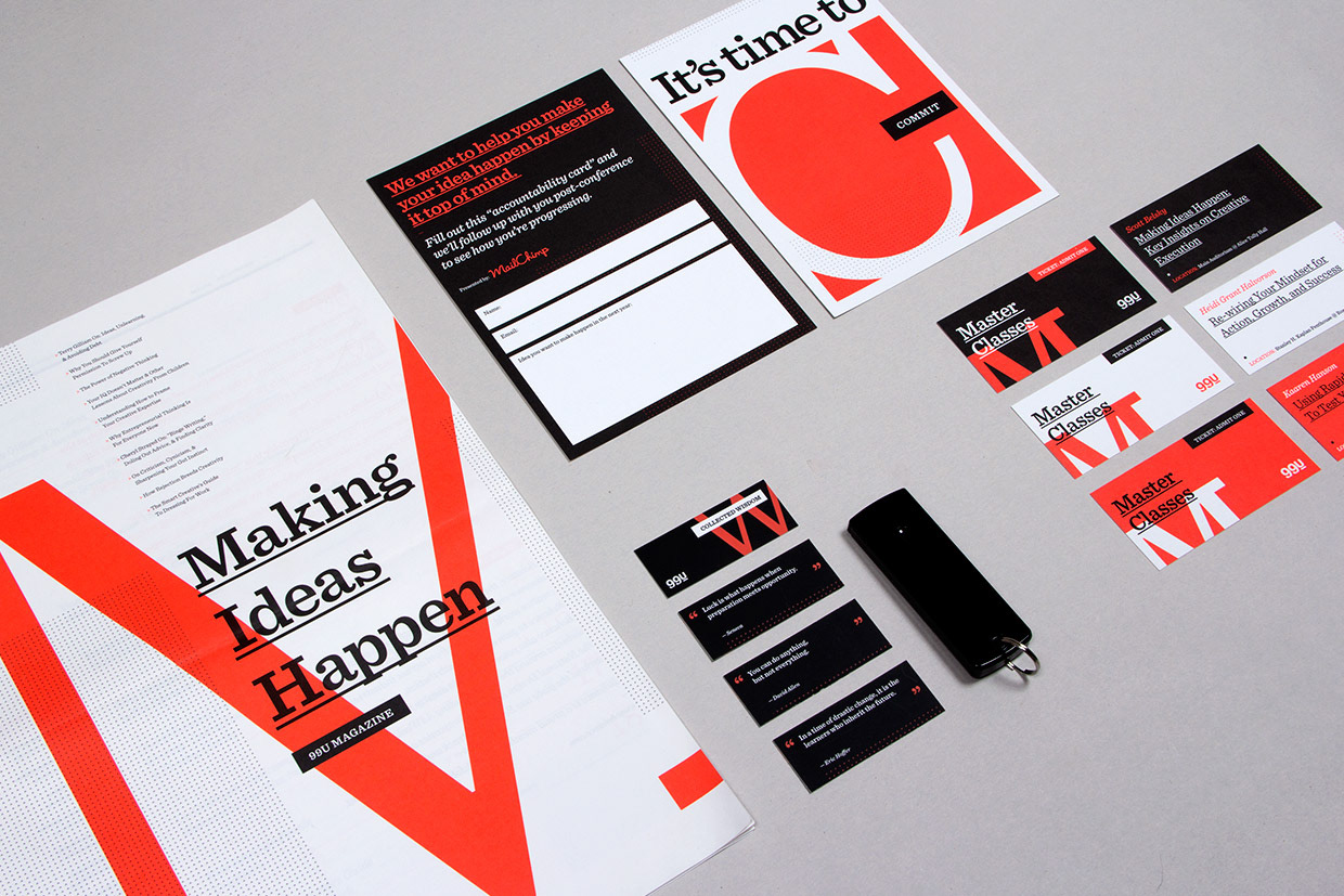
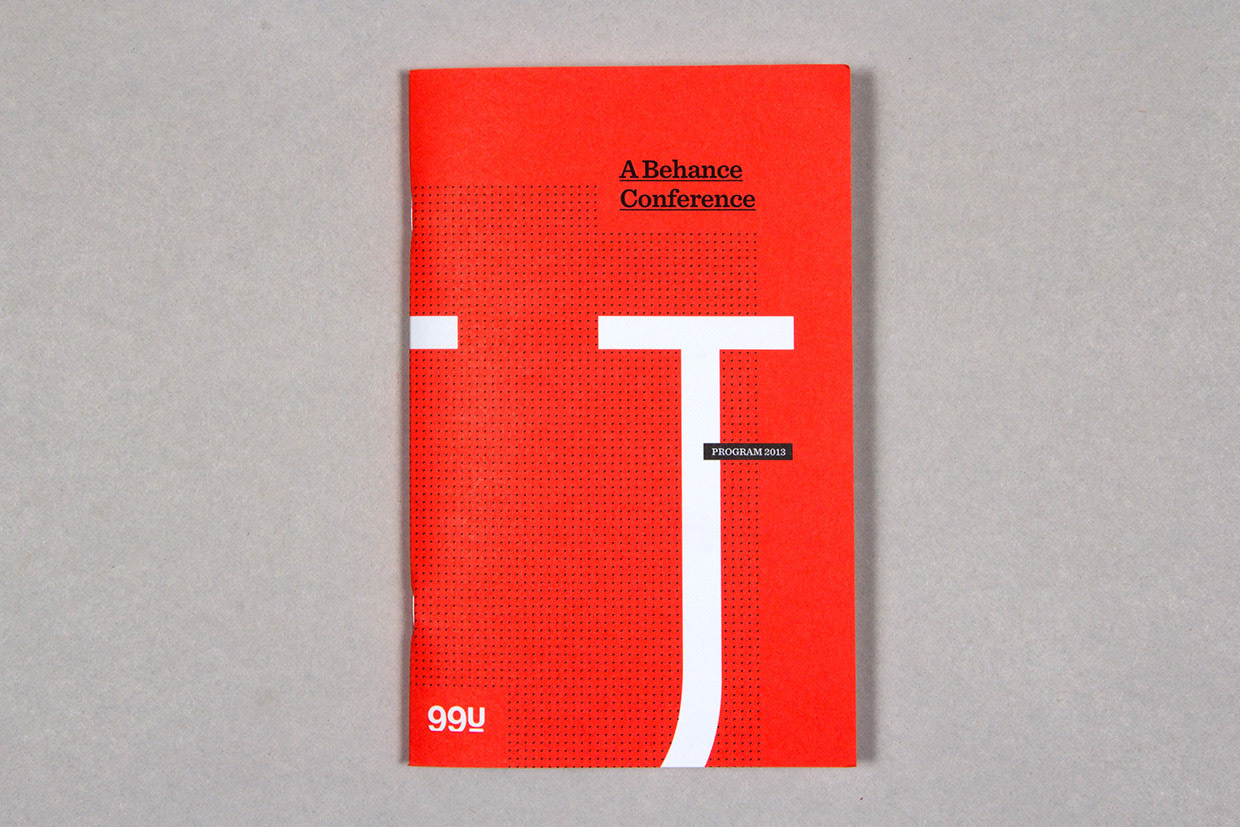
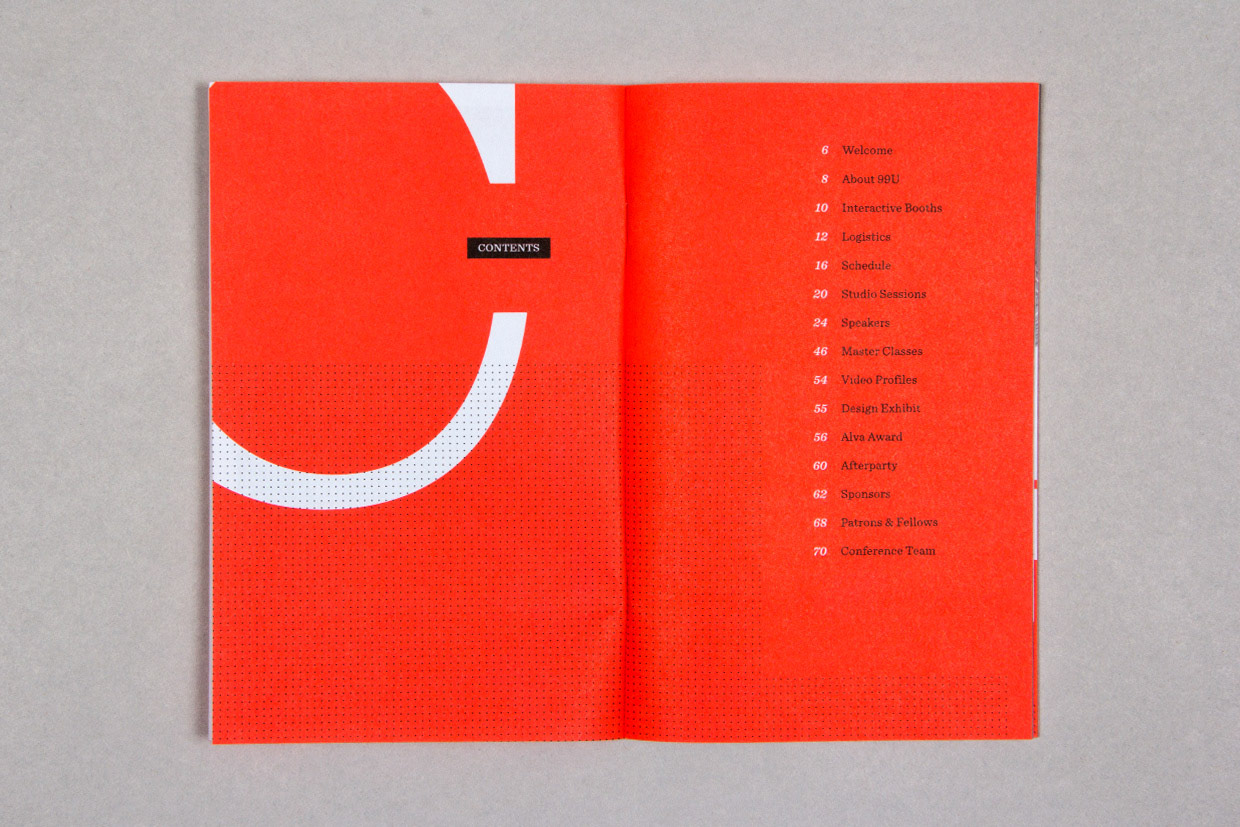
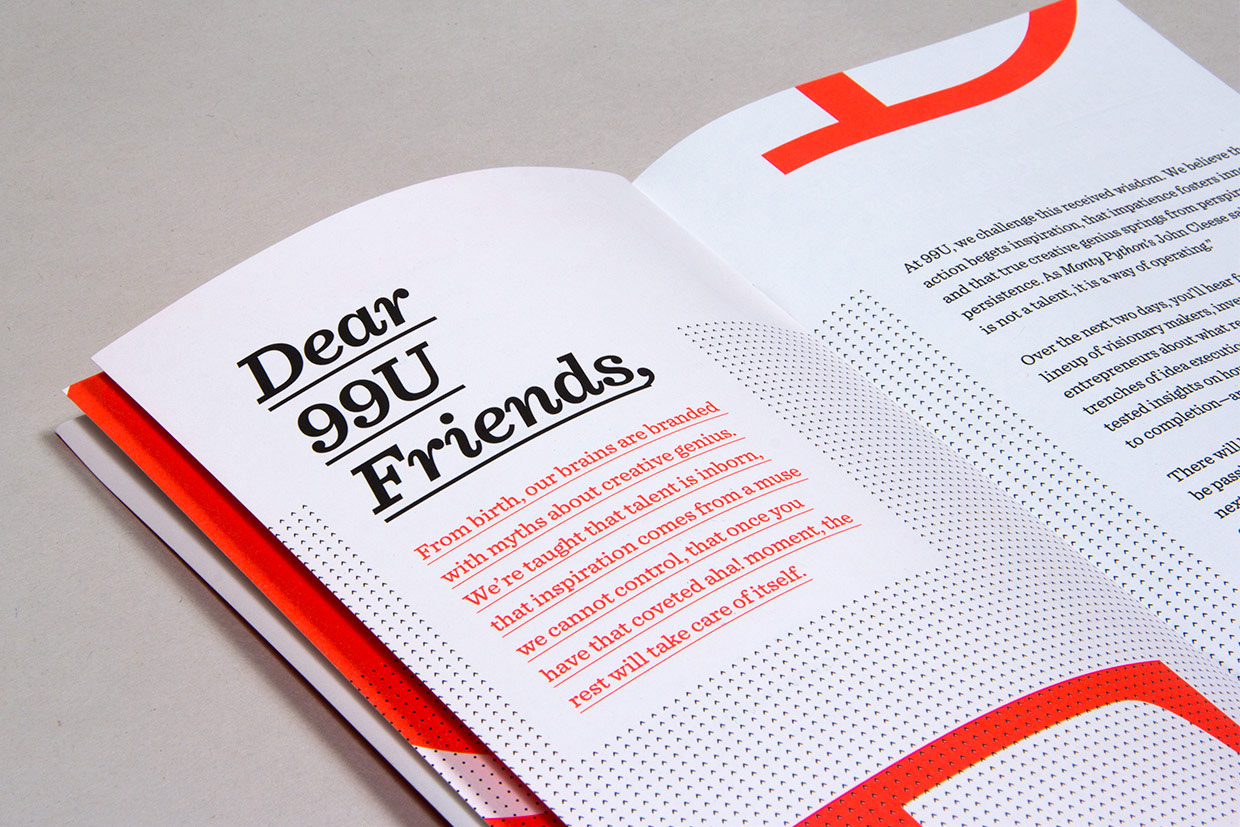
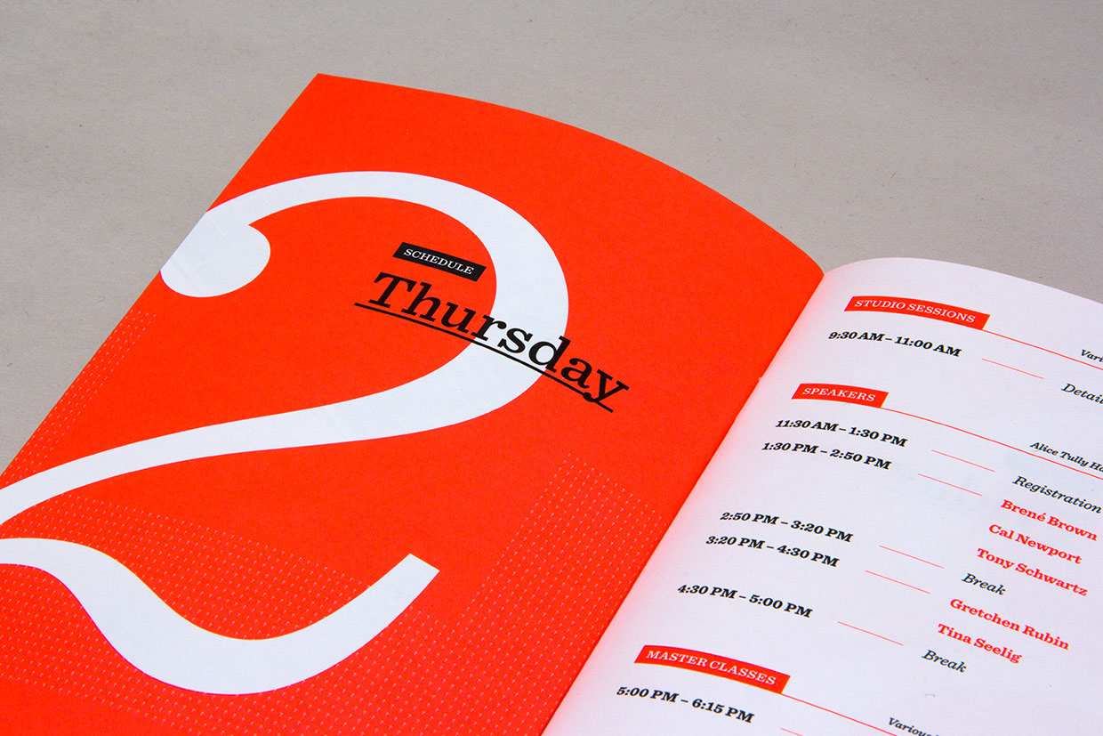
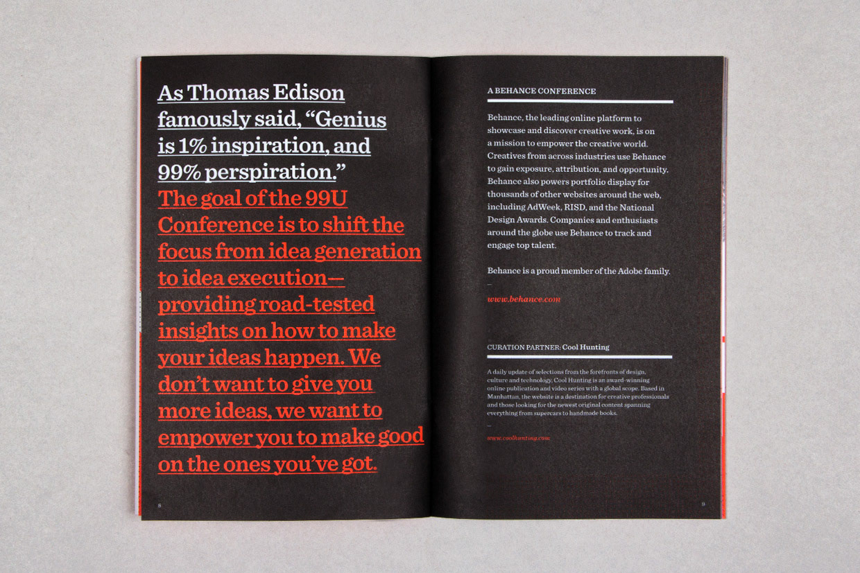
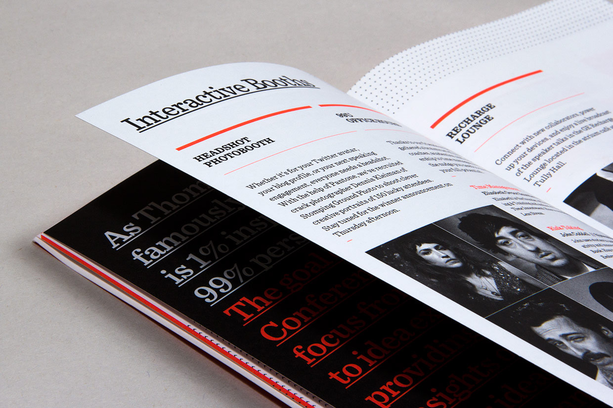
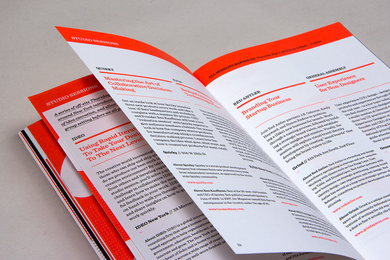
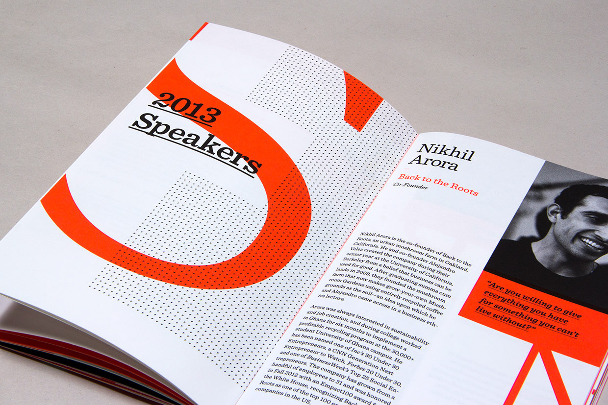
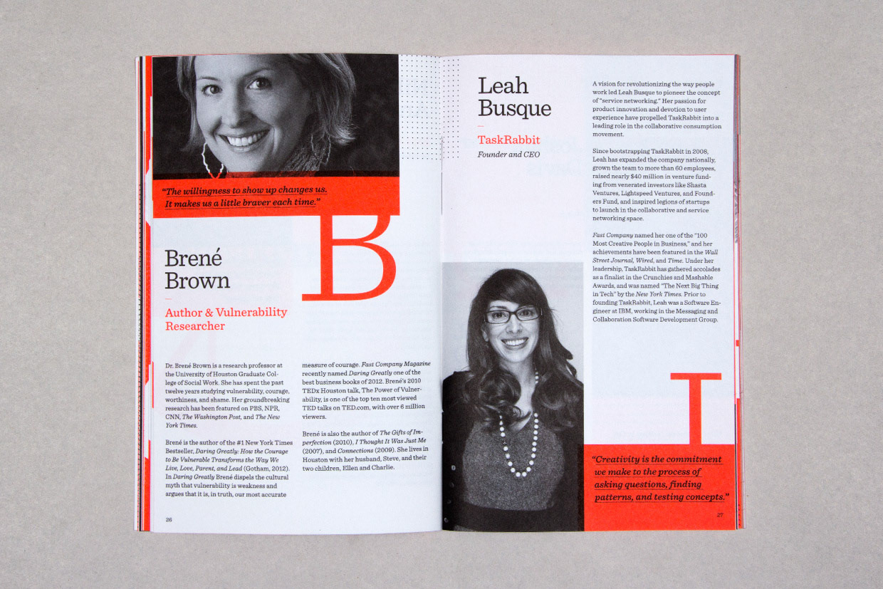
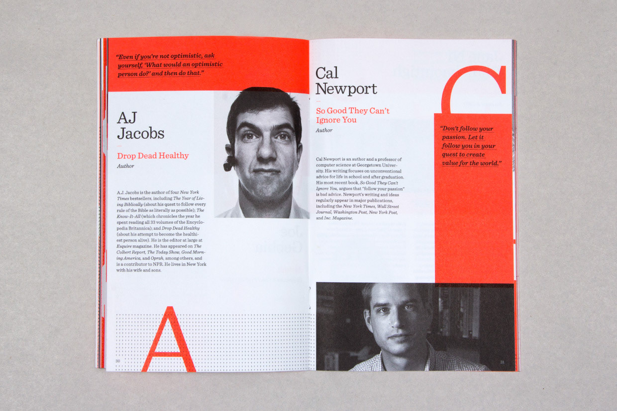
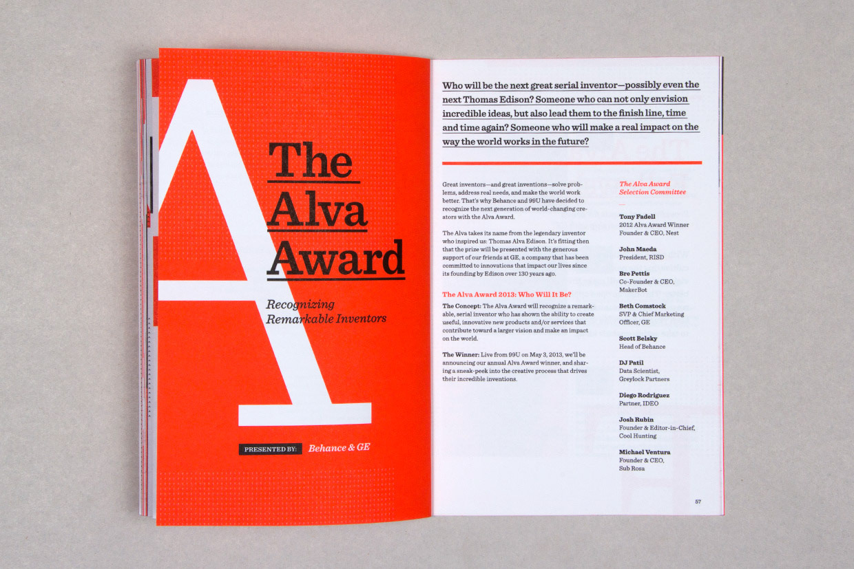
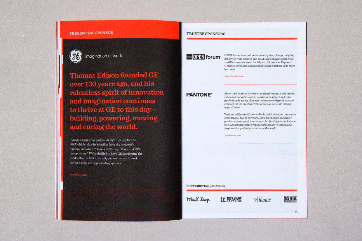
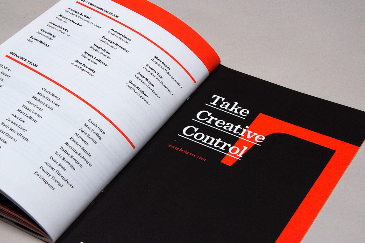
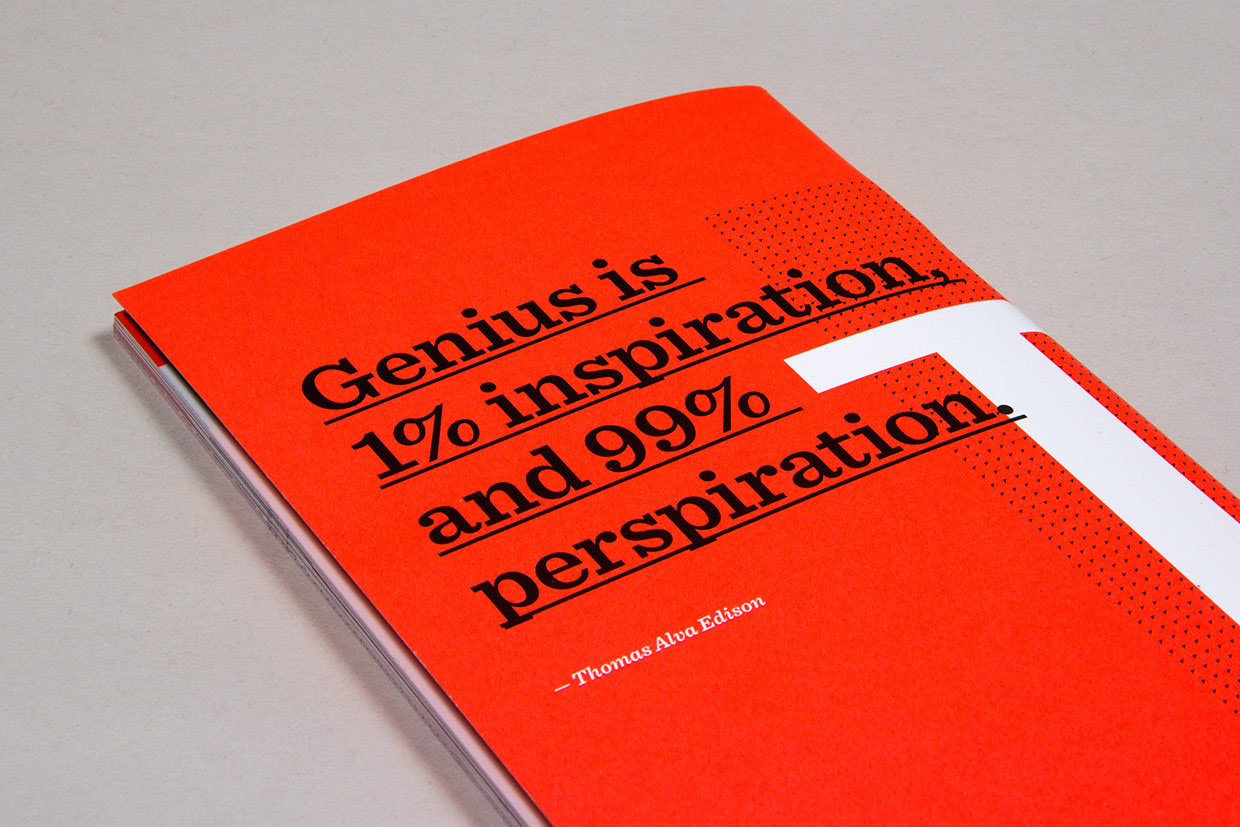
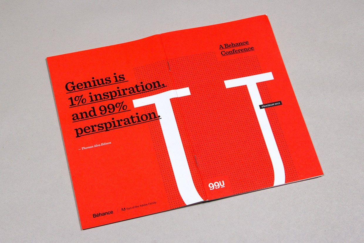
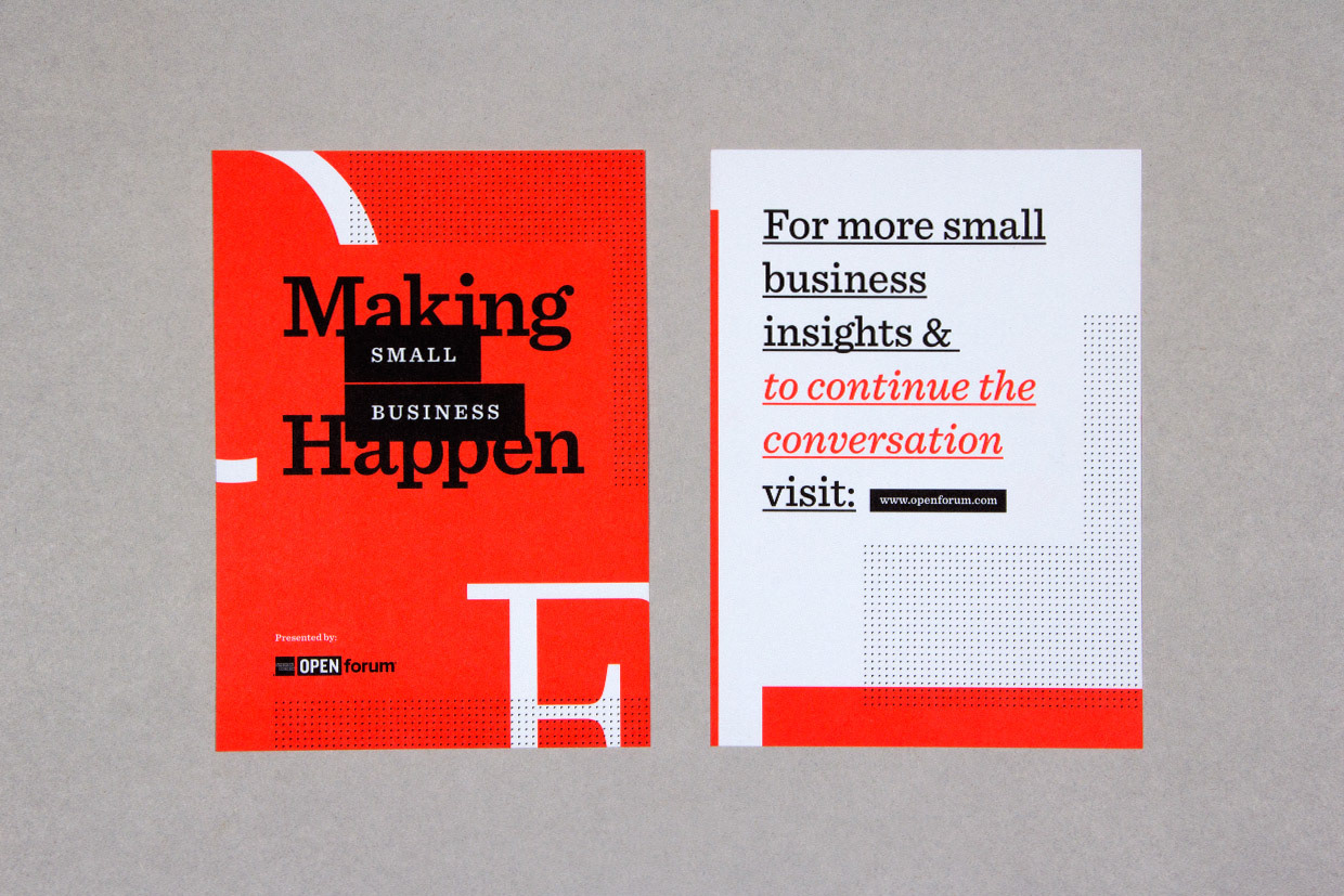
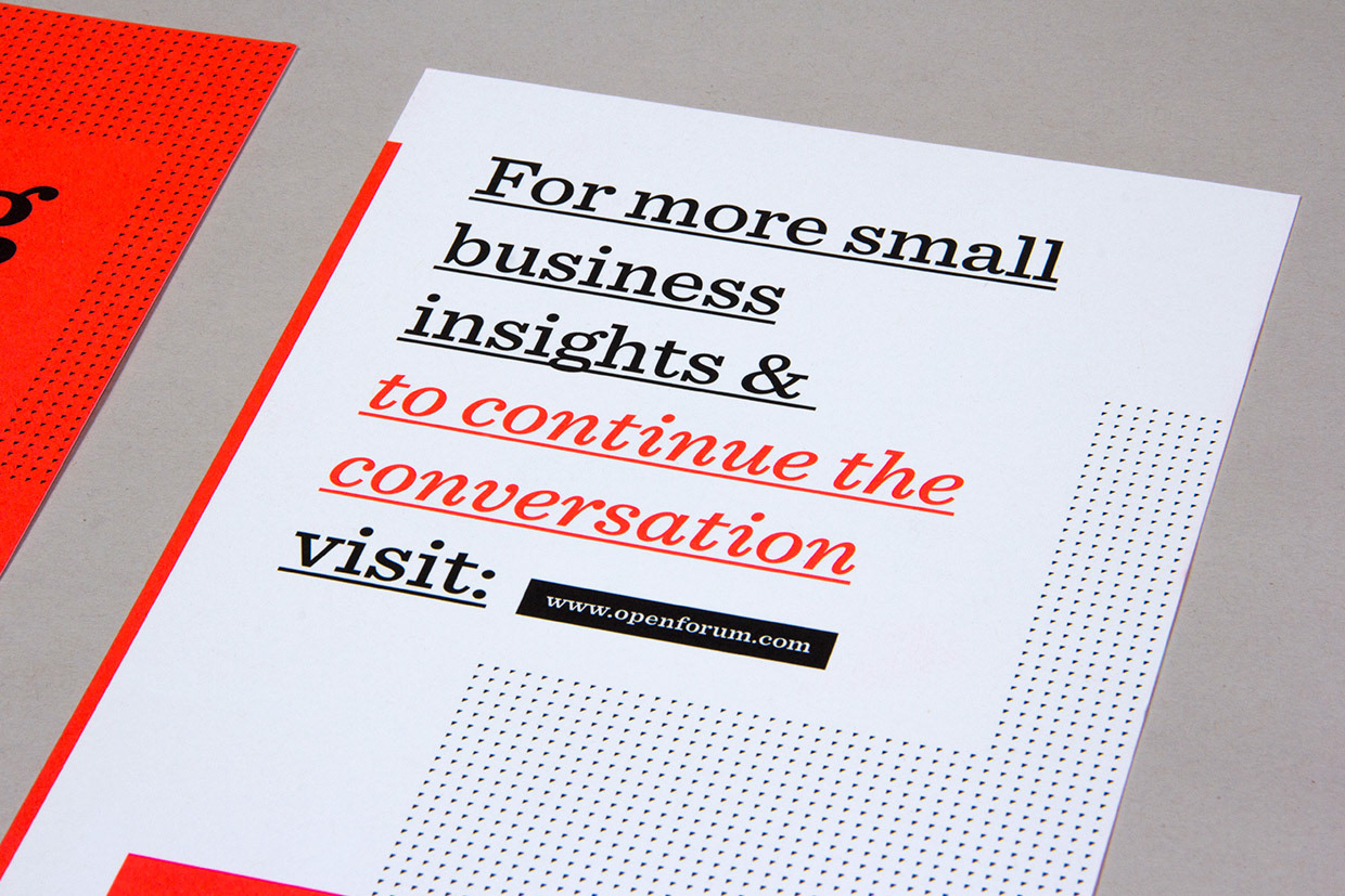
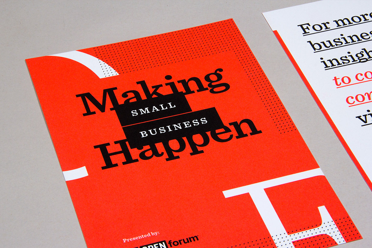
Our approach to the 2013 99U Conference materials embodies a lighter, brighter feeling as we played with the relationship of a bold fluorescent color (Pantone 805 U) on white backgrounds, with periodic accents of black. To push the language of the 99U brand forward, we used Hoefler & Frere-Jone's serif font Sentinel. We focused heavily on typography and using the beautiful letterforms as large shapes. Then we added delicate, detailed patterns to lend depth to the designs.
—
CREATIVE DIRECTION: Matias Corea
EDITORIAL: Jocelyn K. Glei
/// THE INTRO REEL
—
Using actionable quotes from our speakers, we built this motion graphics piece, which brands the space by playing as attendees enter the Conference auditorium. (Motion by Hugh Gran.)
/// THE BROCHURE
—
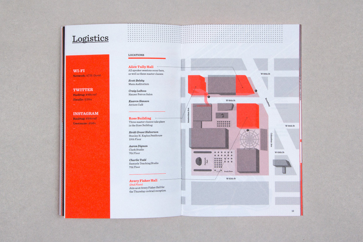
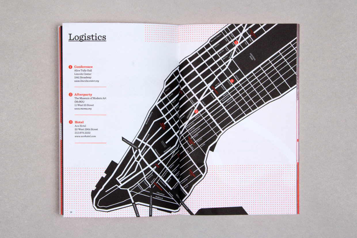
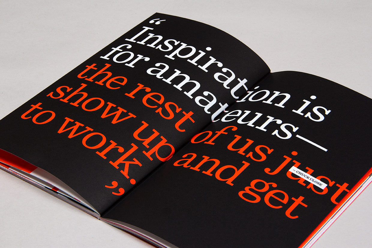
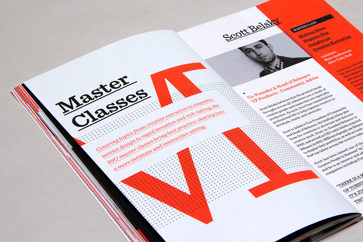
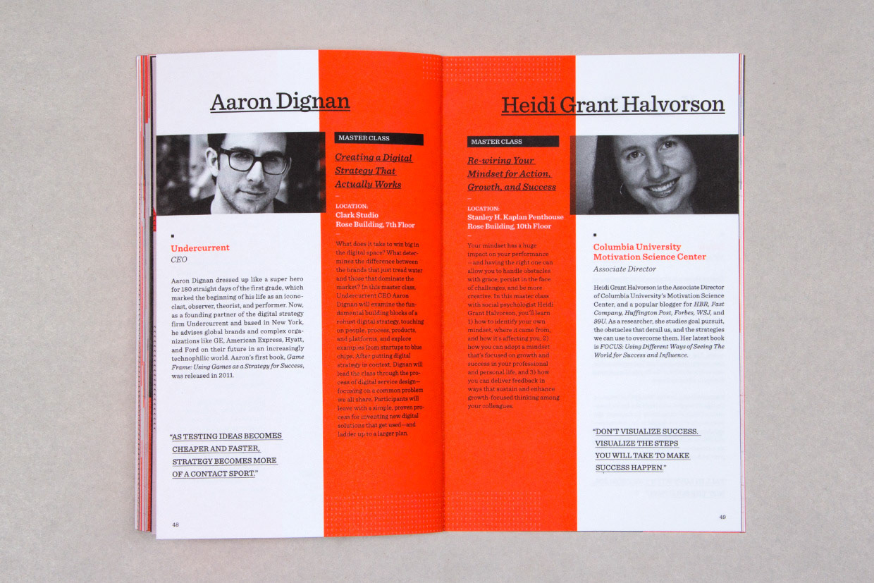
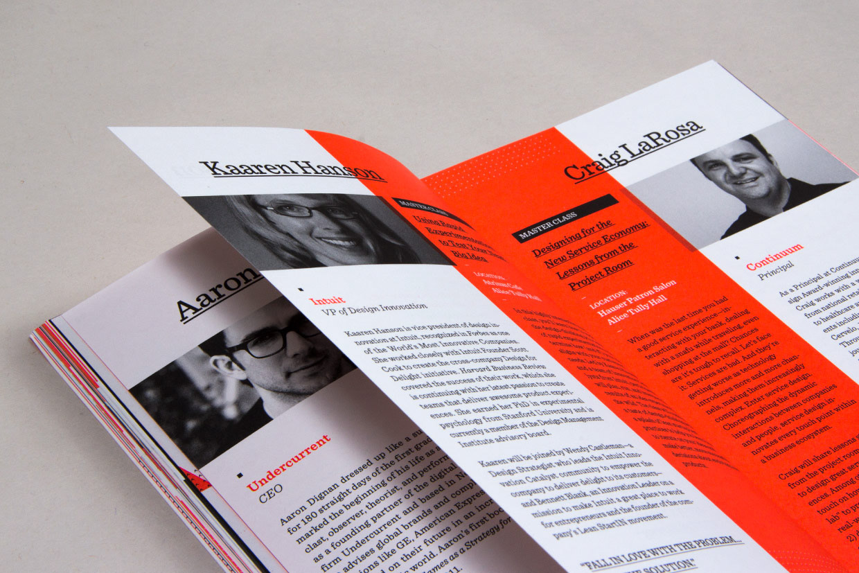
The official 99U Conference brochure gave us ample opportunity to experiment with the design language across 70+ pages, using color and typography to give the piece rhythm and momentum.


/// ACCOUNTABILITY CARD
—
—
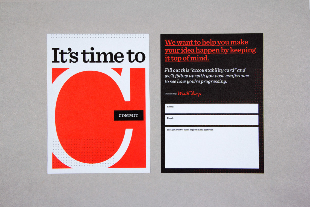
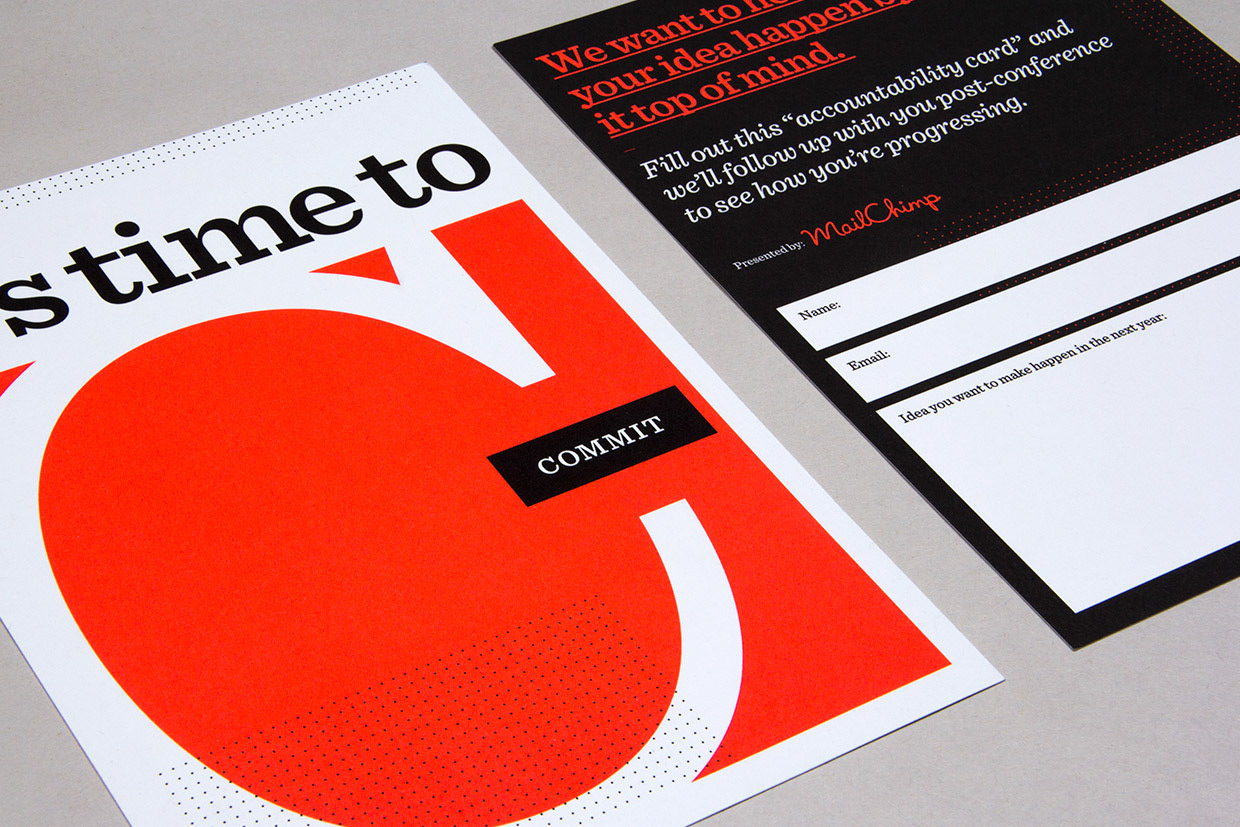
For our sponsor Mailchimp, we created an "accountability card" that attendees fill out to declare their big idea. Then we follow up with them via email after the event to see how their project is going.
/// THE GOODIES
—
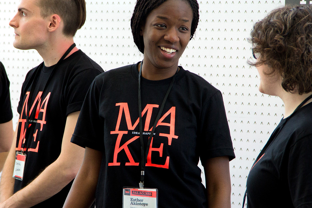
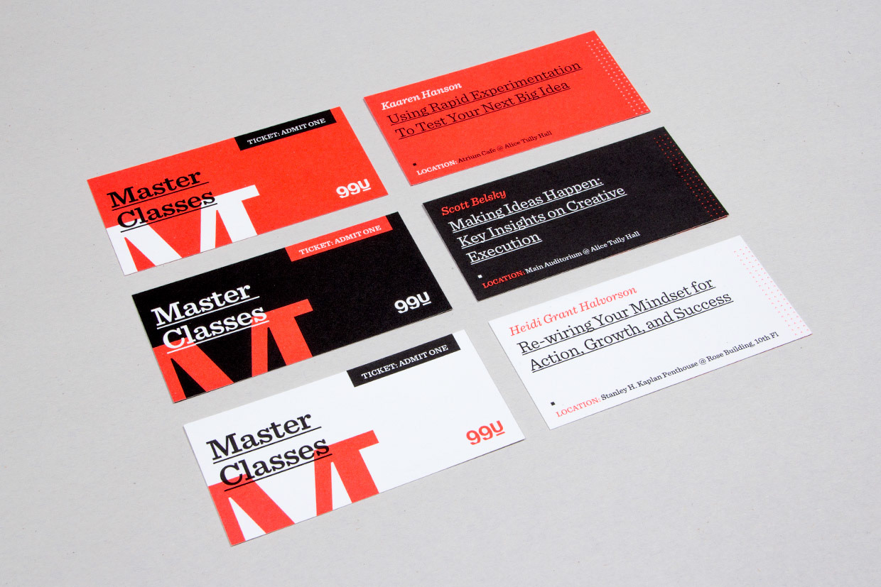
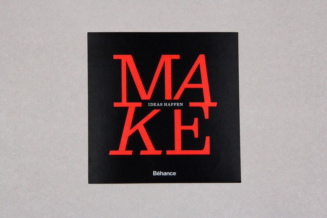
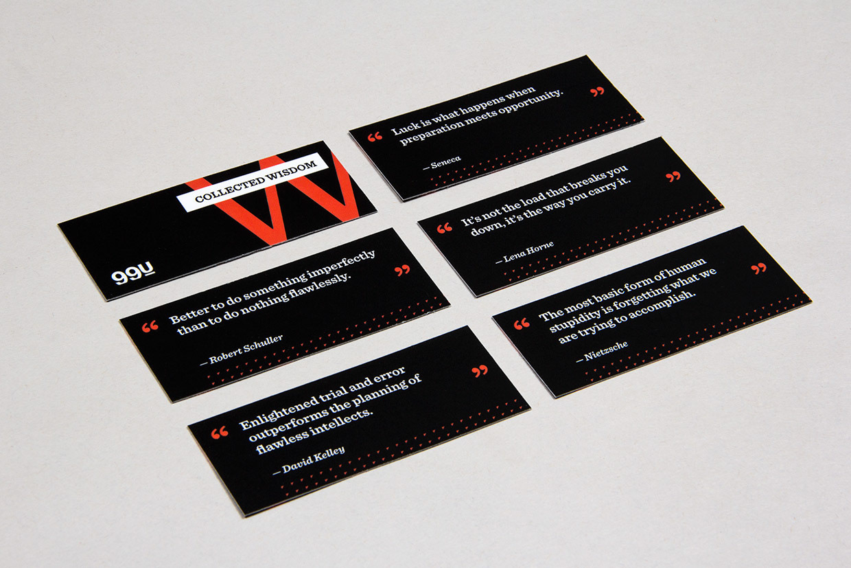
We also created a color system for the tickets for the Conference master classes, a custom "make ideas happen" sticker, and a series of mini "quote cards" to inspire action.
/// OPENFORUM BOOTH CARD
—
/// POCKET GUIDES
—
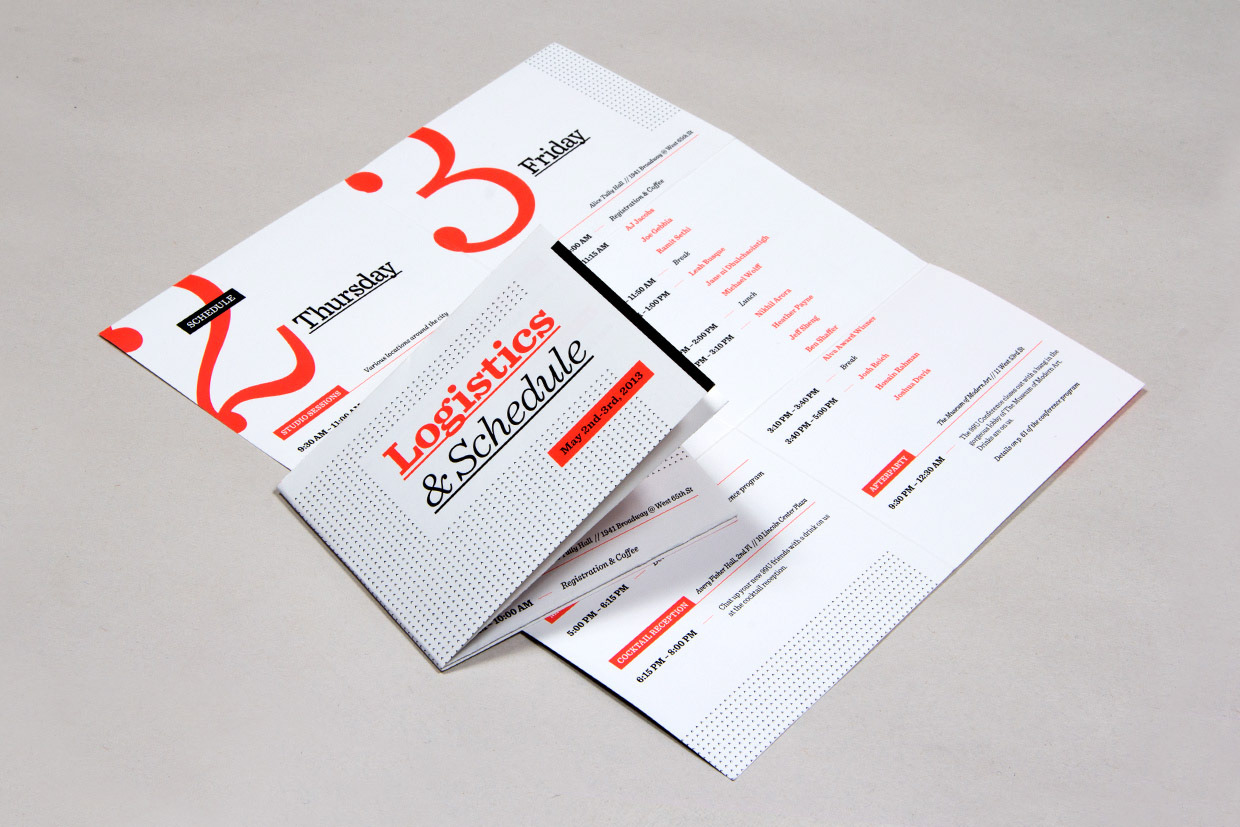
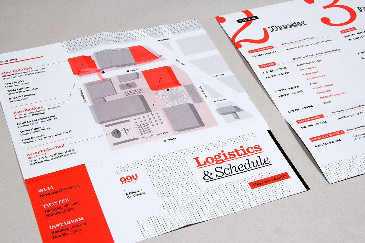
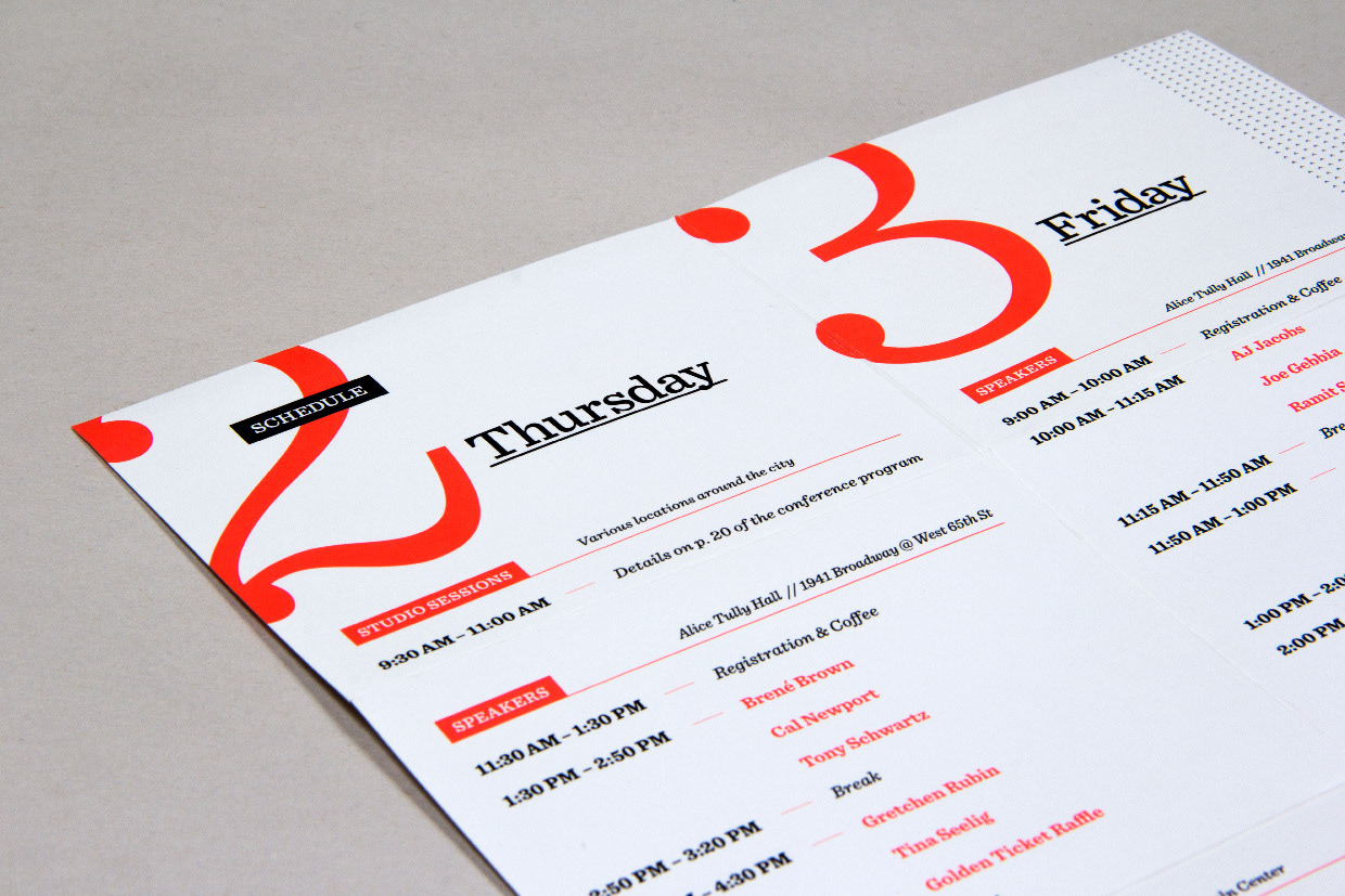
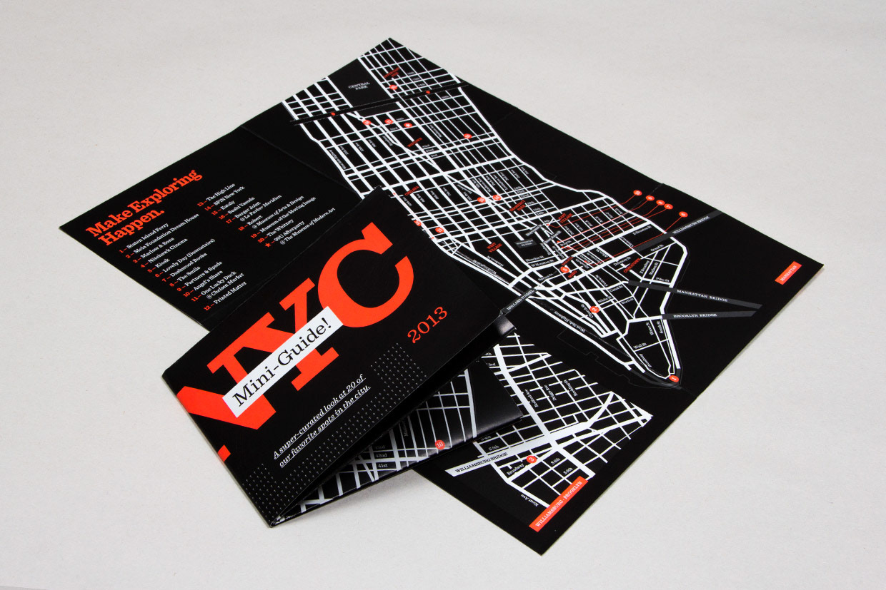
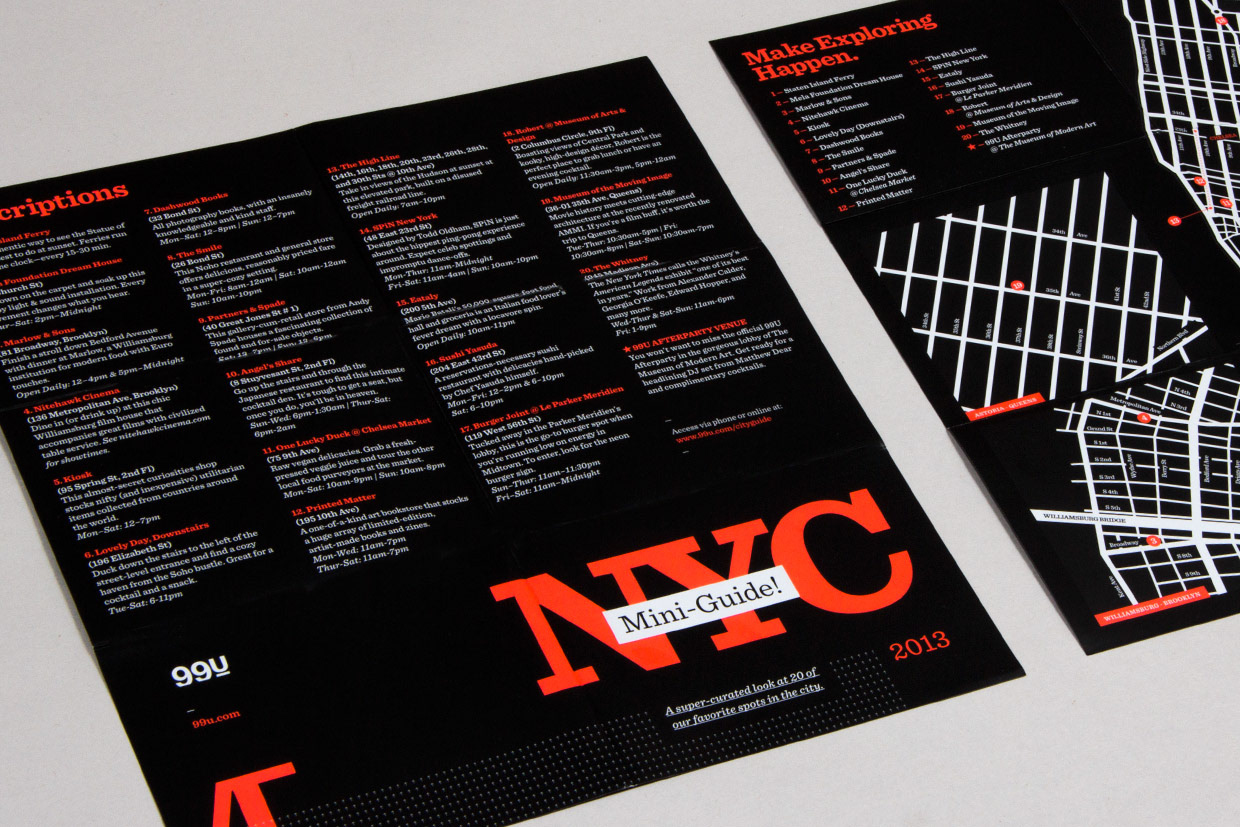
Our pocket guides keep the most essential 99U Conference information handy, including the event basics like a daily schedule & map, as well as a city guide for finding the choicest spots around New York City.
/// THE MAGAZINE
—
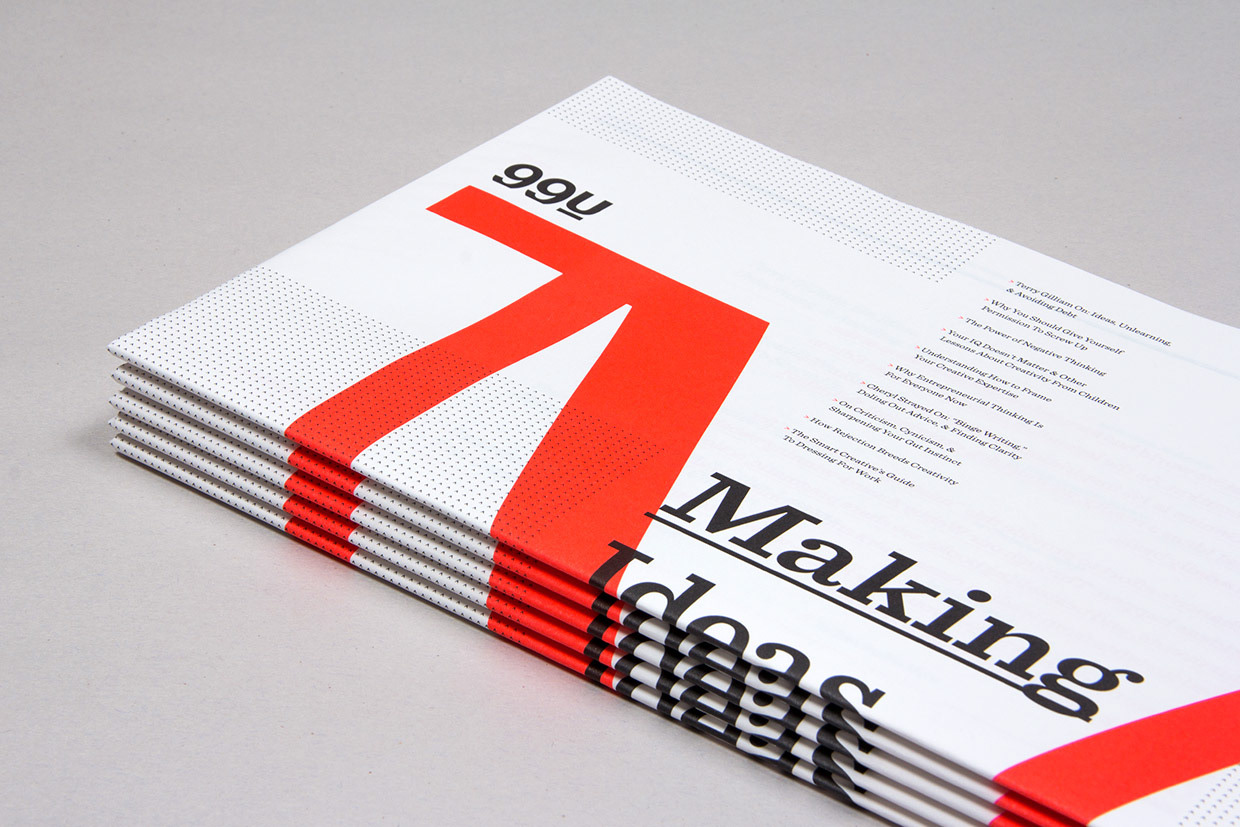
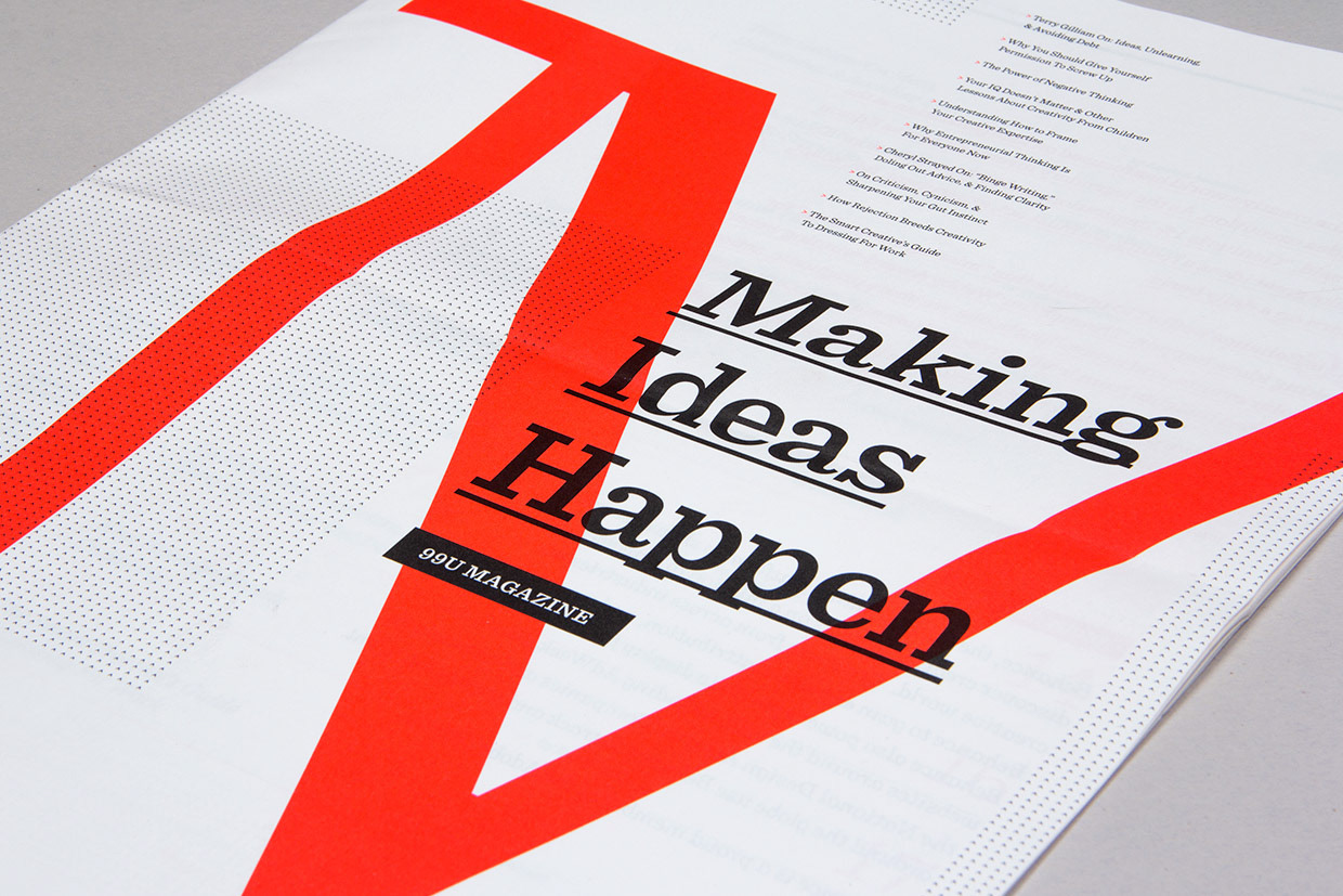
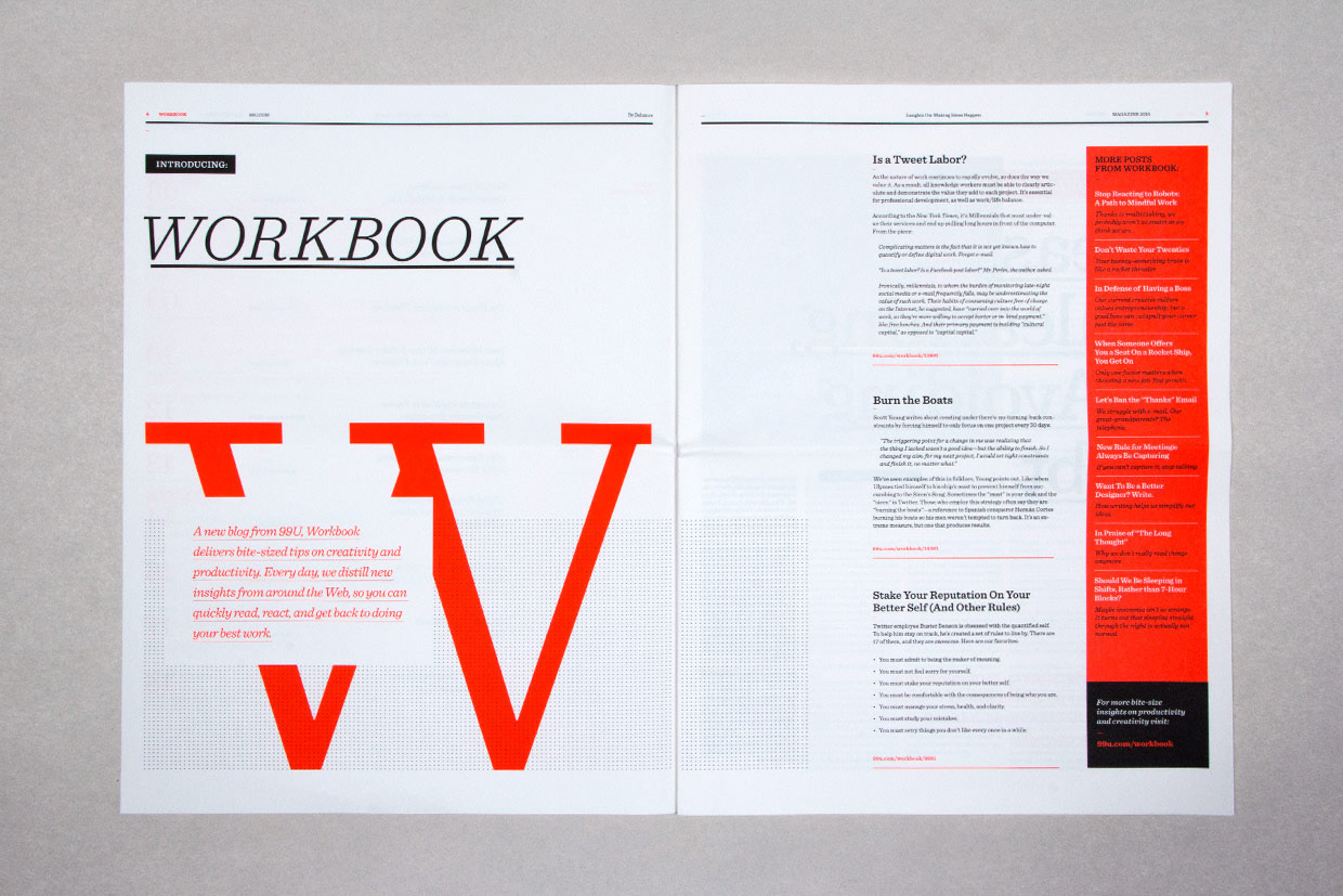
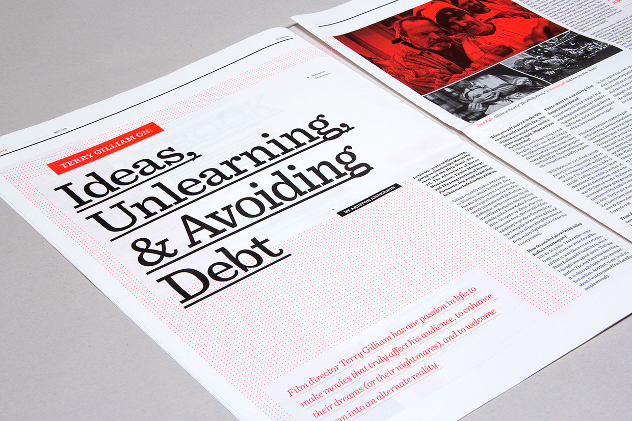
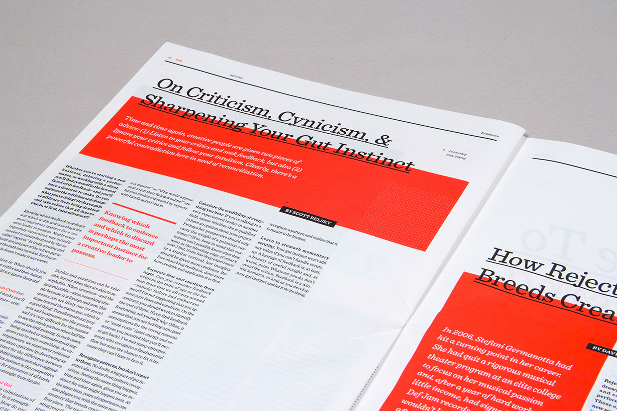
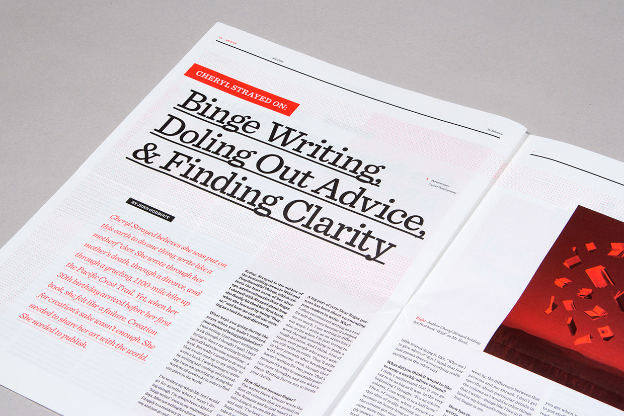
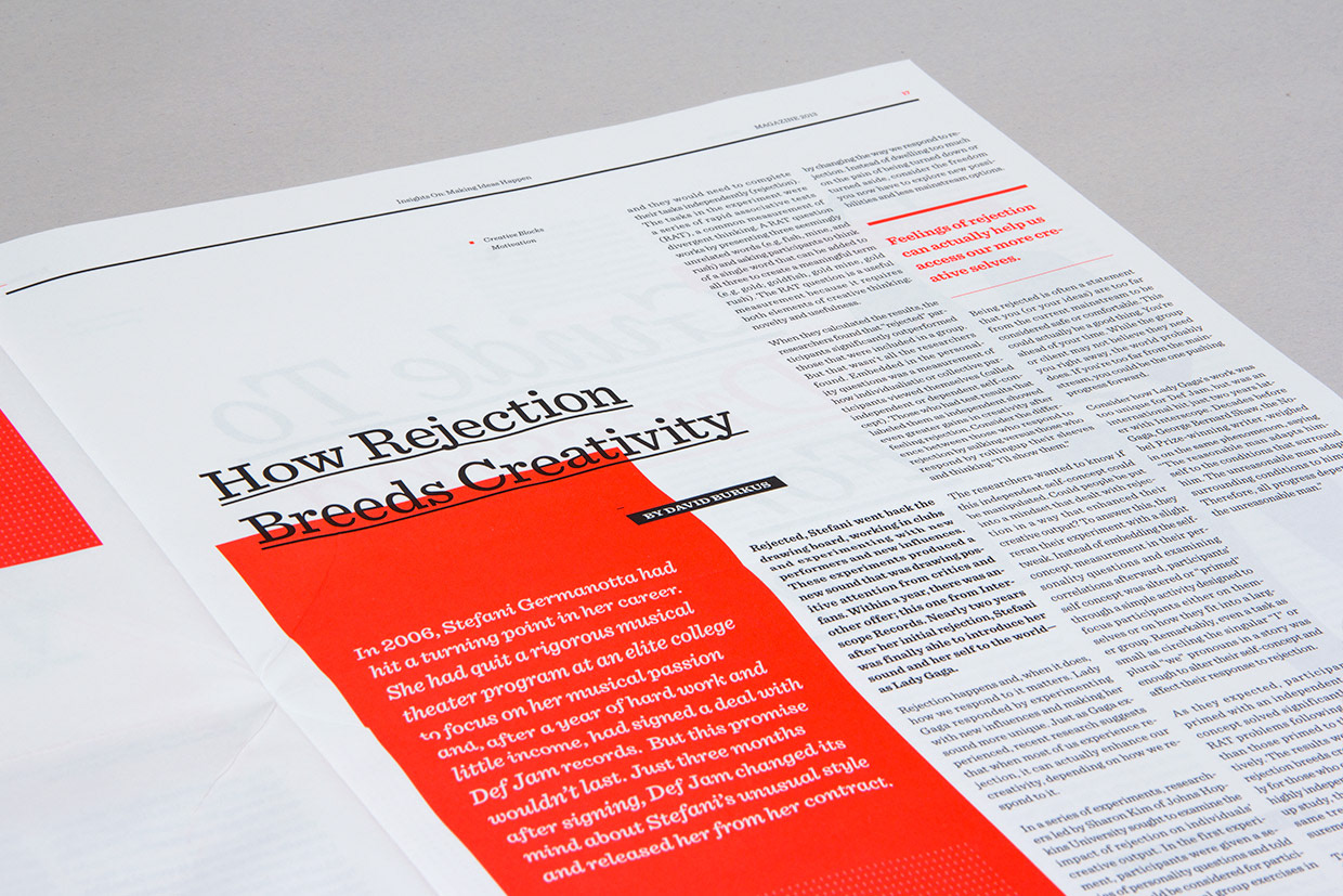
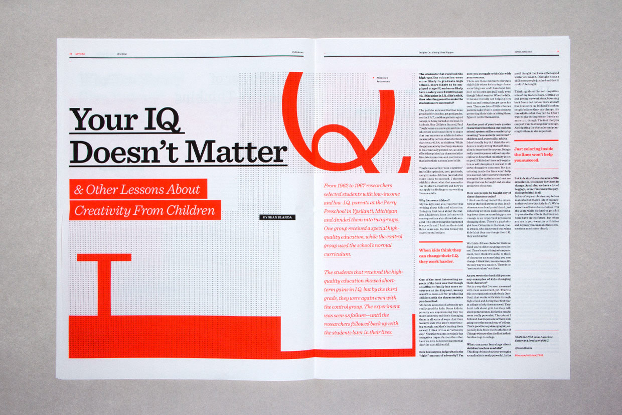
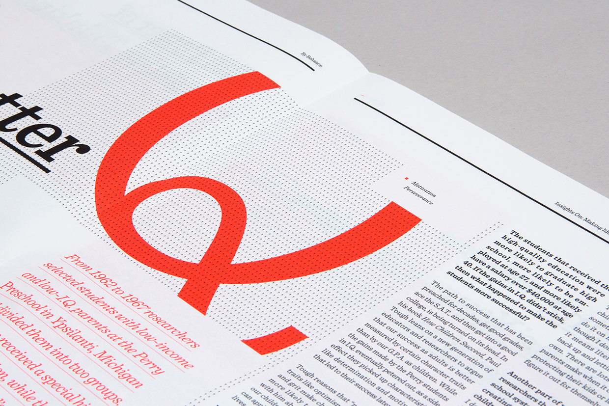
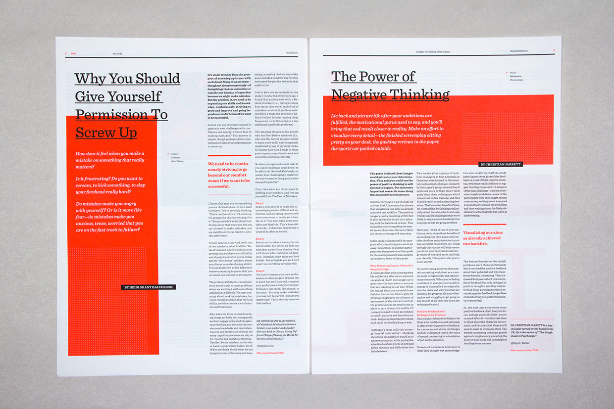
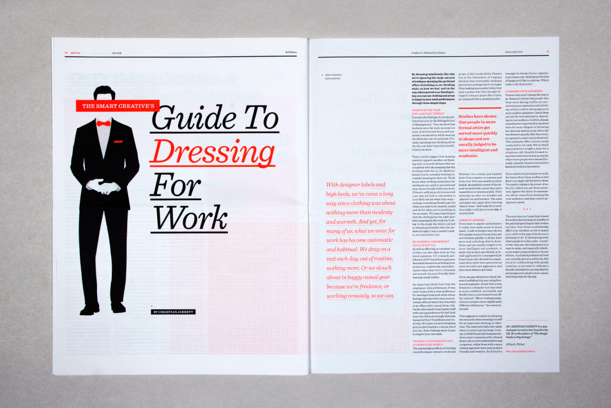
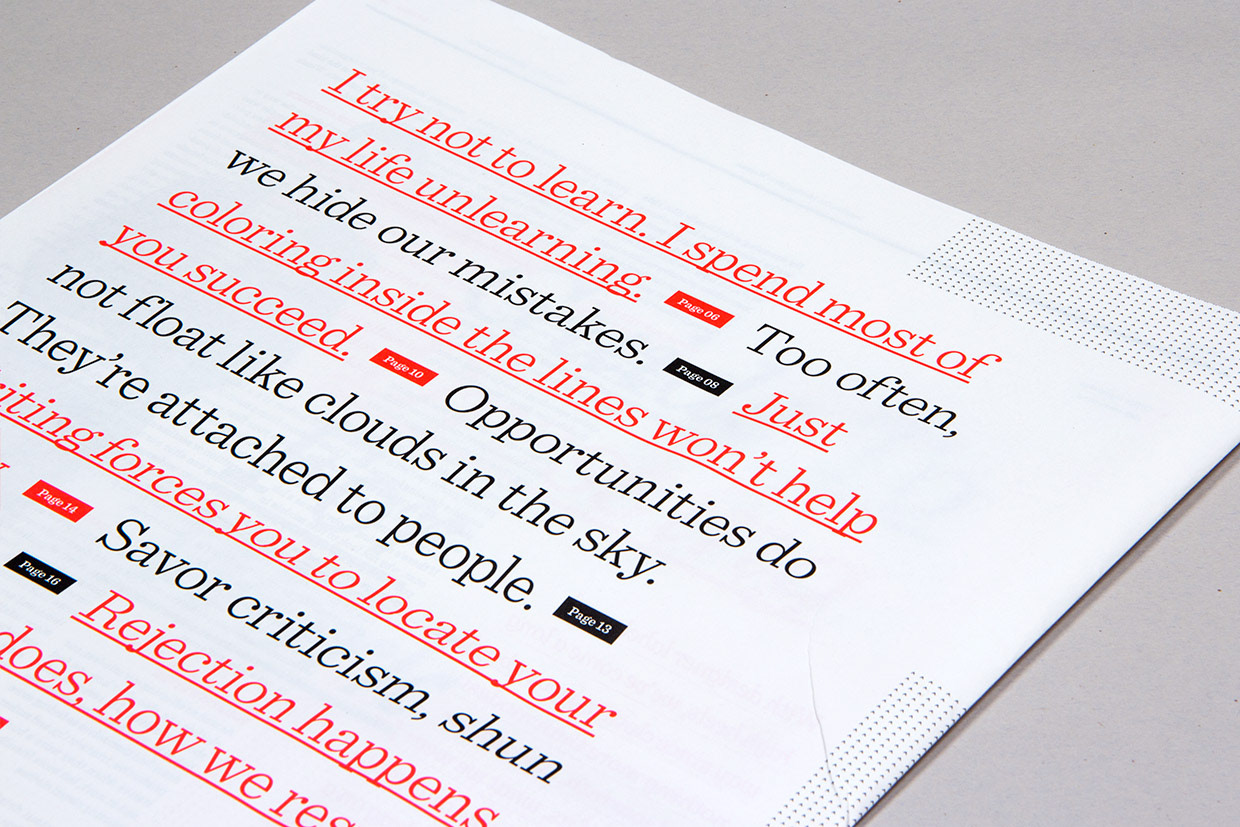
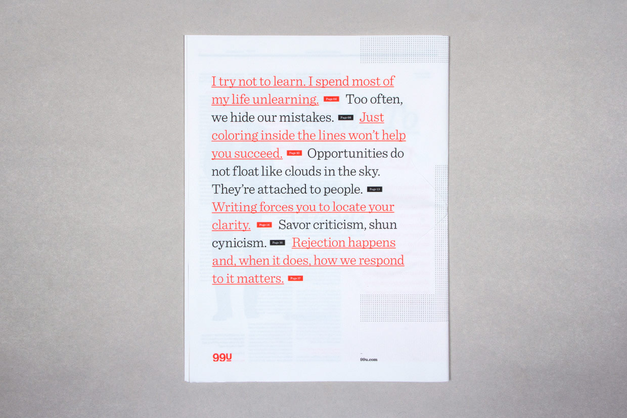
This year we used the elegant Sentinel font, pattern overlays, and bright pops of color to create a sophisticated, highly readable print piece.
This year we used the elegant Sentinel font, pattern overlays, and bright pops of color to create a sophisticated, highly readable print piece.


/// THE BRANDING IN ACTION
–
