99% Conference Materials 2011
Print Collateral for the 99% Conference 2011
Behance's 99% Conference brings 400 leading creatives together for two days purely focused on exploring the mechanics of idea execution. Every year, we re-imagine and re-design all of the conference materials to give the event a fresh, dynamic look.
For 2011, we chose Pantone 333 U as our official color, the inverse (on the color spectrum) of our usual 99% hot pink. For fonts, we selected H&FJ fonts Vitesse and Tungsten to use throughout all our materials.
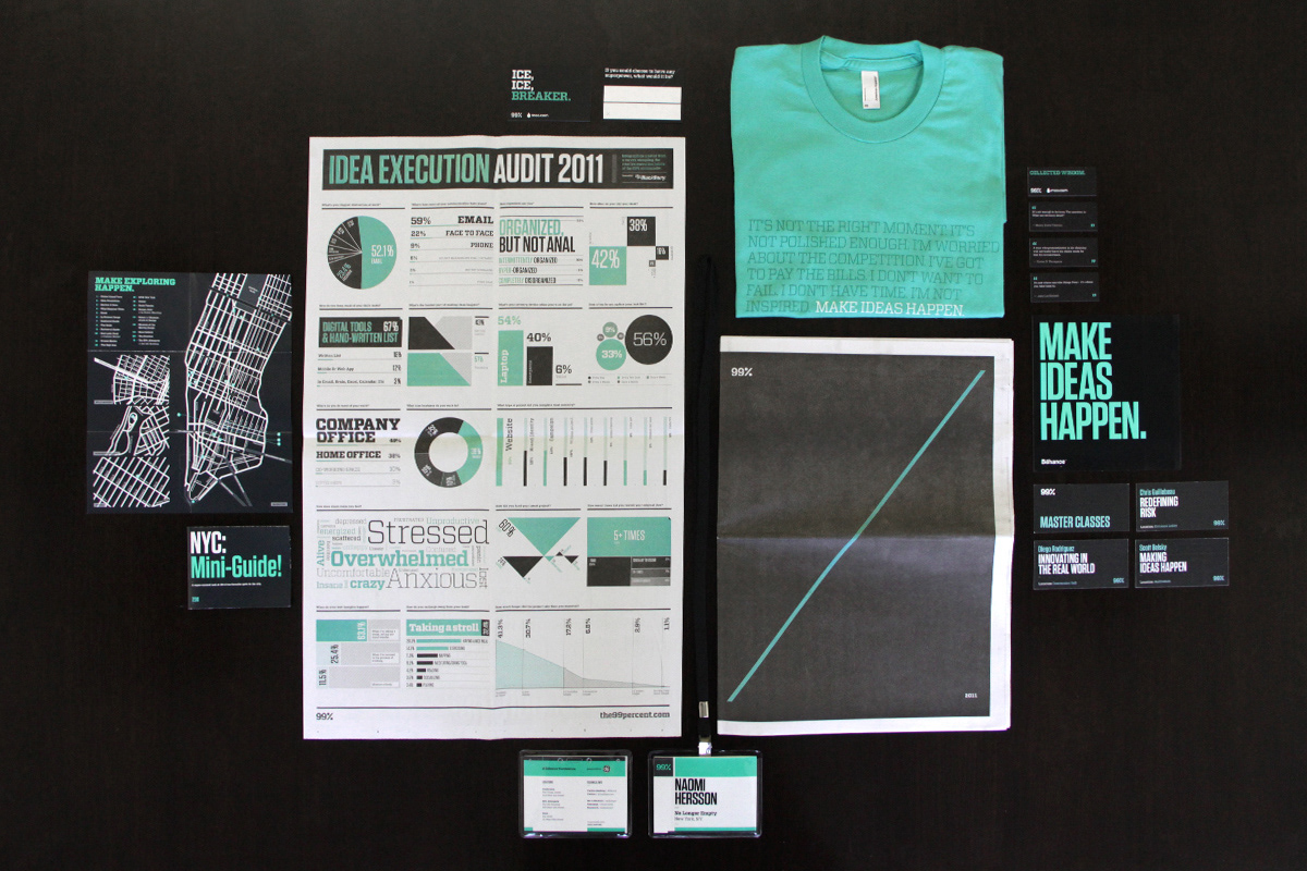
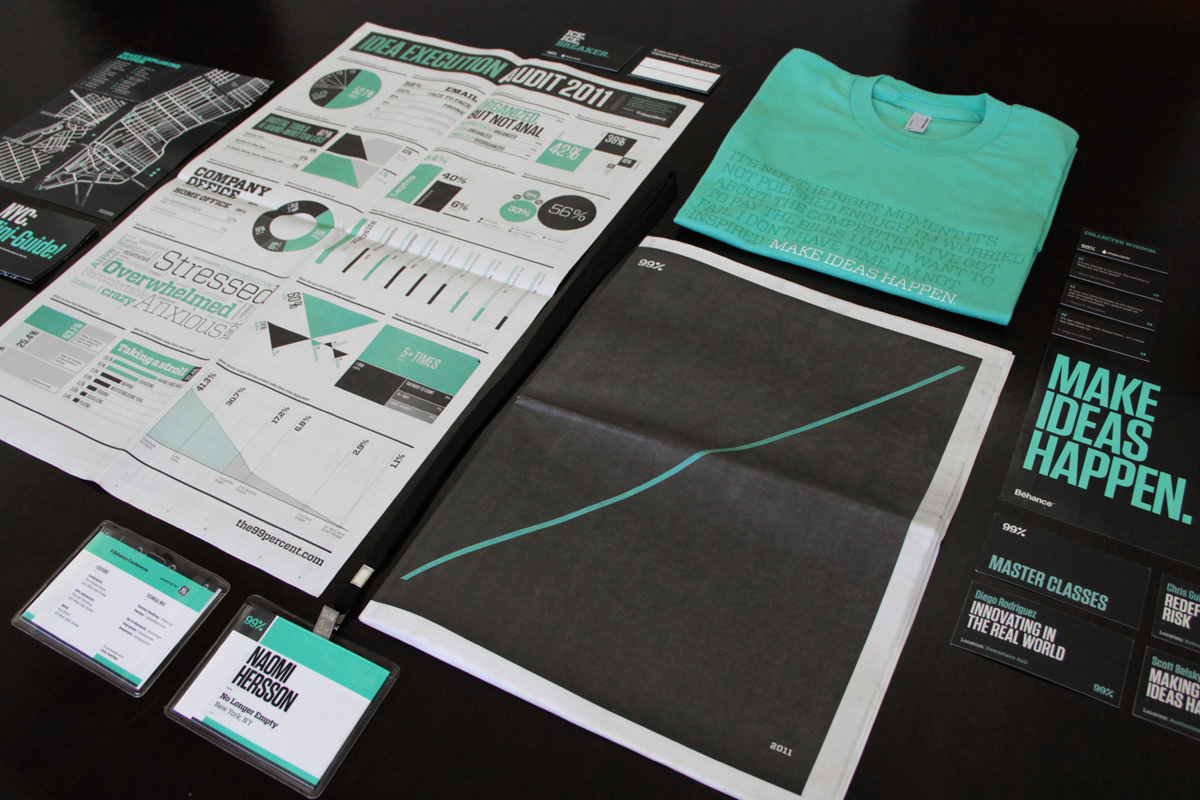
With these tools in hand, we translated the 99% brand across a tabloid-size print brochure, an info-graphic poster, a tee-shirt, a city guide, name badges, and much more.
For 2011, we chose Pantone 333 U as our official color, the inverse (on the color spectrum) of our usual 99% hot pink. For fonts, we selected H&FJ fonts Vitesse and Tungsten to use throughout all our materials.
With these tools in hand, we translated the 99% brand across a tabloid-size print brochure, an info-graphic poster, a tee-shirt, a city guide, name badges, and much more.
—
/// The Intro Reel
Using original quotations on idea execution from our speakers, we designed and animated this custom motion graphics reel that plays in between presentations throughout the Conference. (Motion by Hugh Gran. )
Using original quotations on idea execution from our speakers, we designed and animated this custom motion graphics reel that plays in between presentations throughout the Conference. (Motion by Hugh Gran. )
/// The Poster
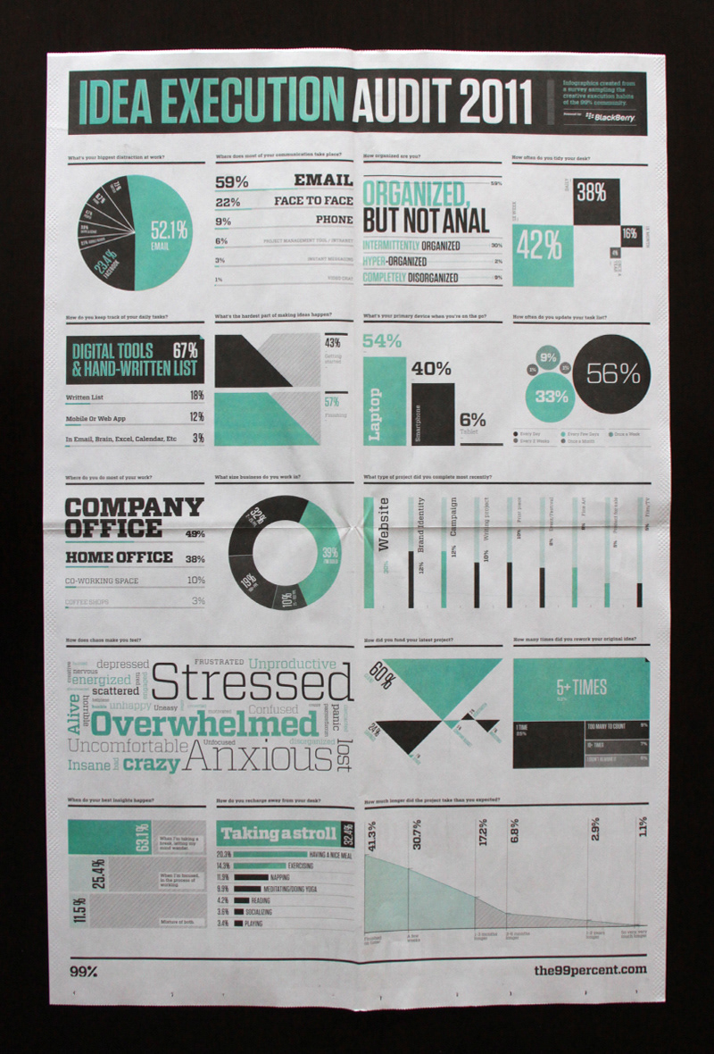
Each year, we also conduct an annual Idea Execution Audit, polling the Behance community about HOW they're making ideas happen. Then we translate the results into a beautiful, infographic poster.
Each year, we also conduct an annual Idea Execution Audit, polling the Behance community about HOW they're making ideas happen. Then we translate the results into a beautiful, infographic poster.
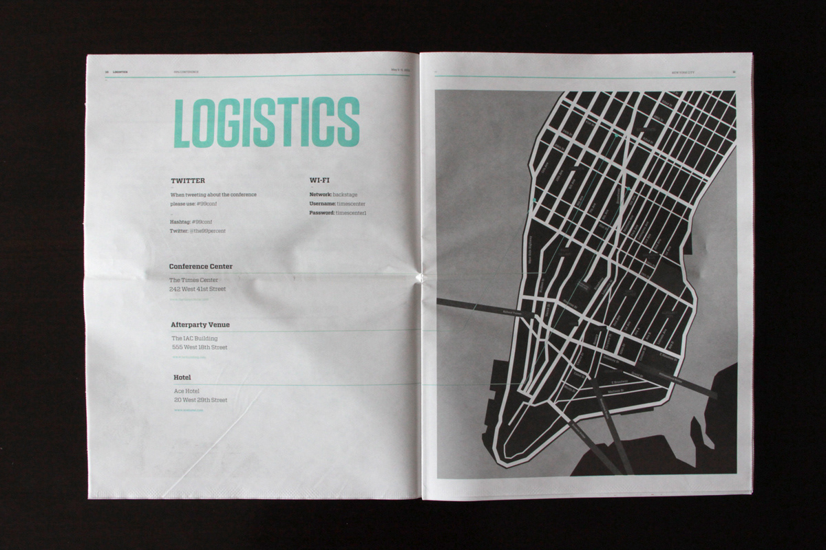
/// The Goodies
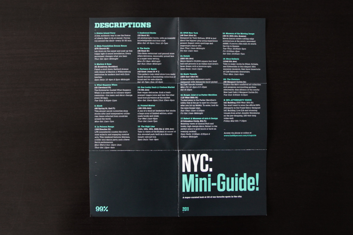
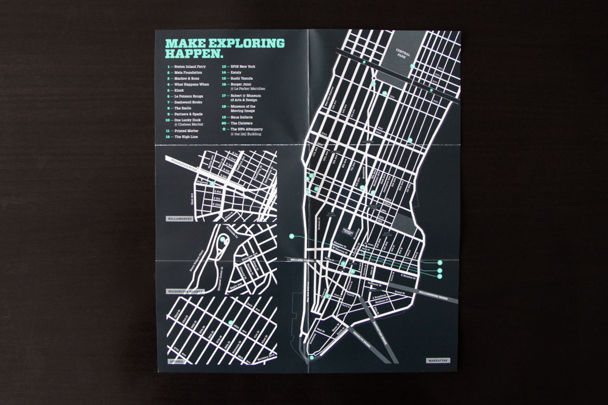
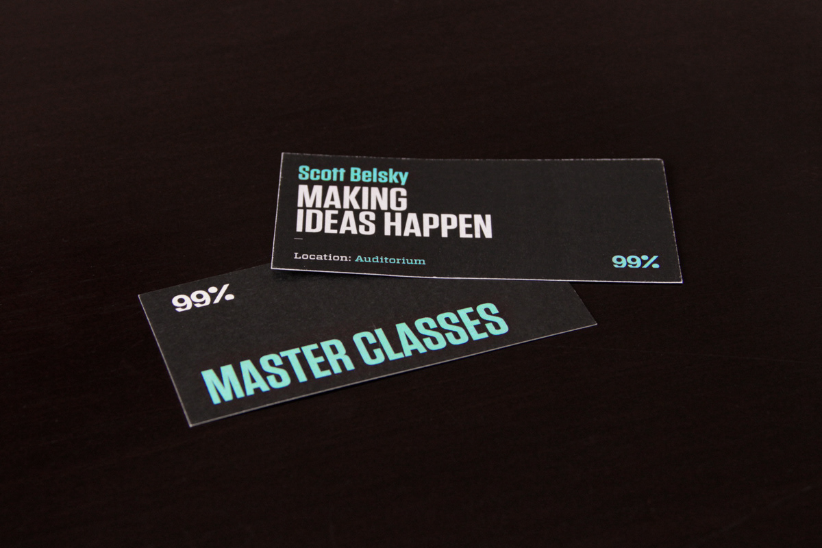
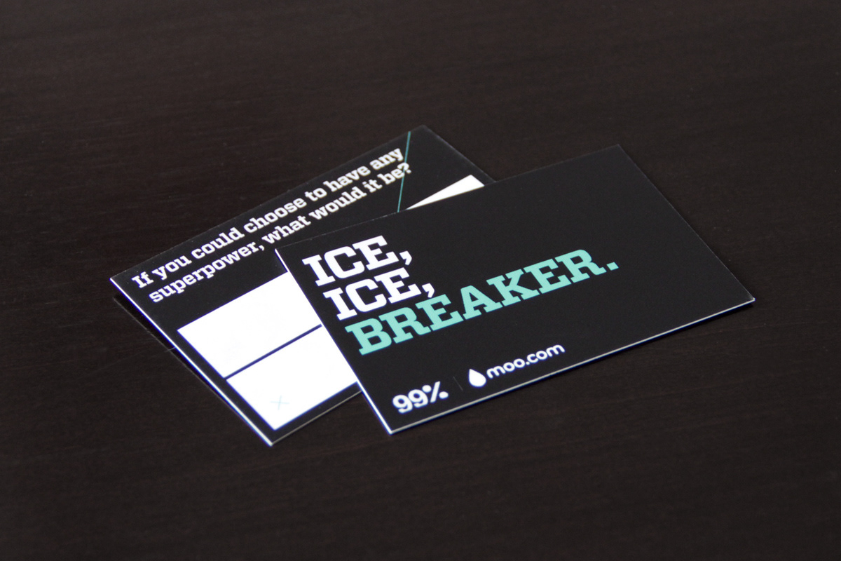
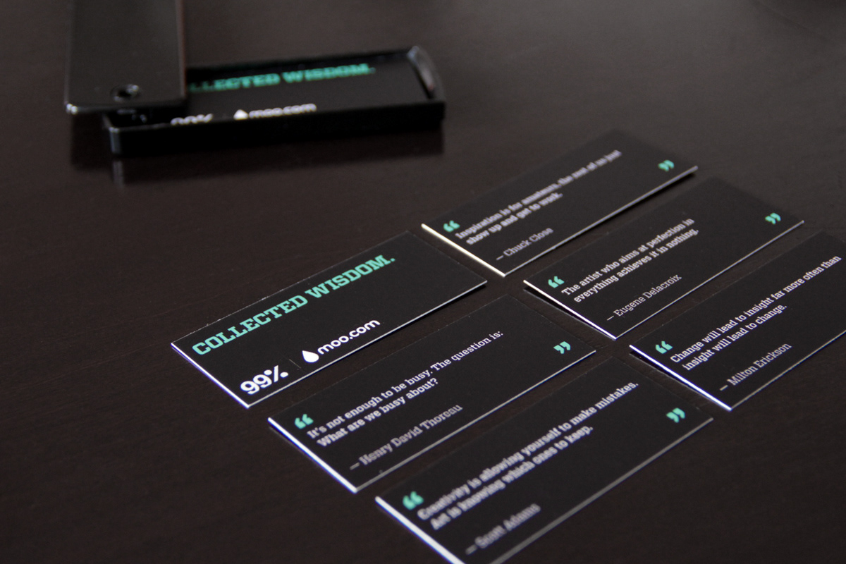
In addition to the above, our conference welcome bags come equipped with all kinds of goodies. From a no-nonsense "make ideas happen" sticker, to a super-curated guide to NYC, to custom tickets and inspirational quote cards, and our charming ice breaker tags.
In addition to the above, our conference welcome bags come equipped with all kinds of goodies. From a no-nonsense "make ideas happen" sticker, to a super-curated guide to NYC, to custom tickets and inspirational quote cards, and our charming ice breaker tags.
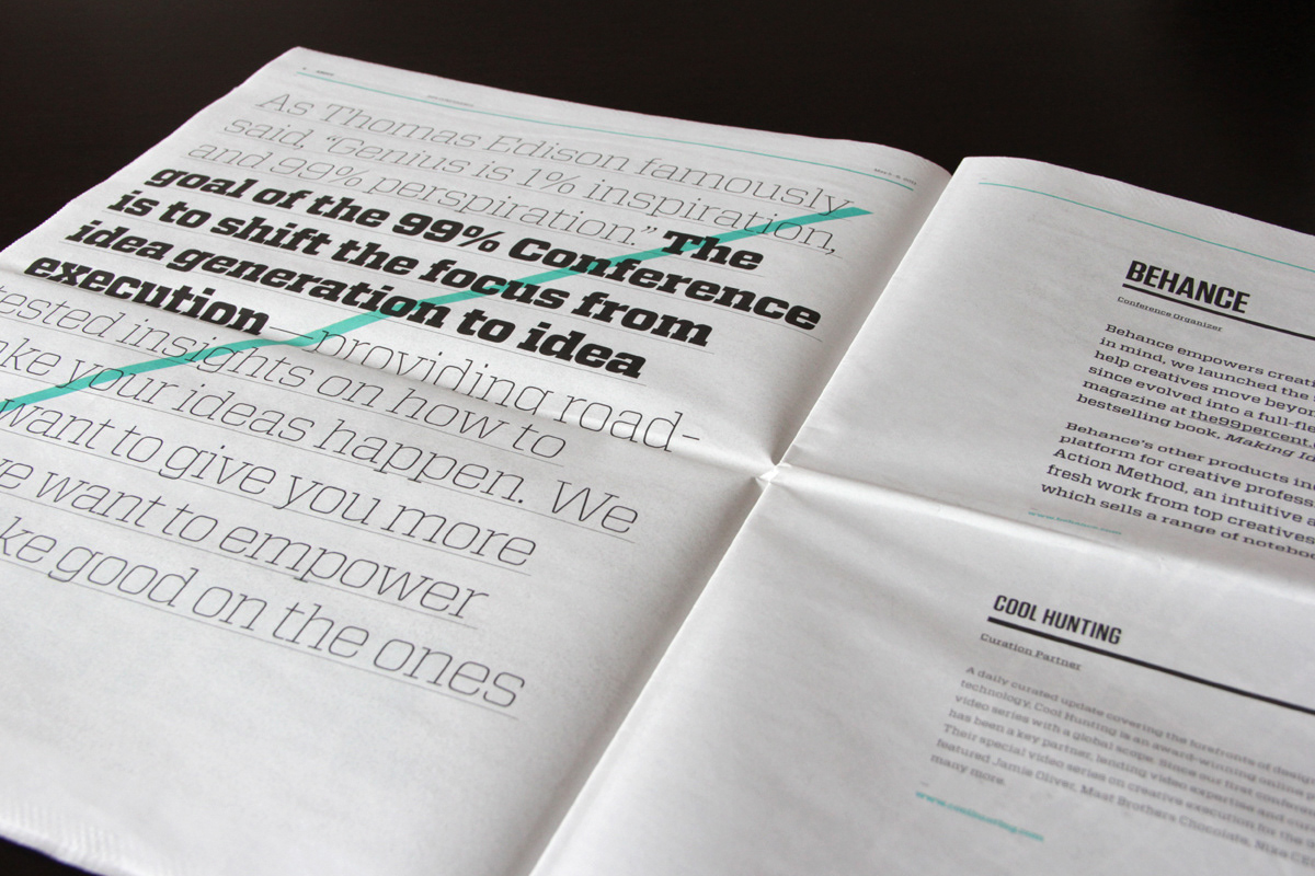
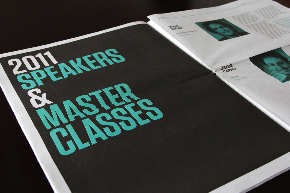
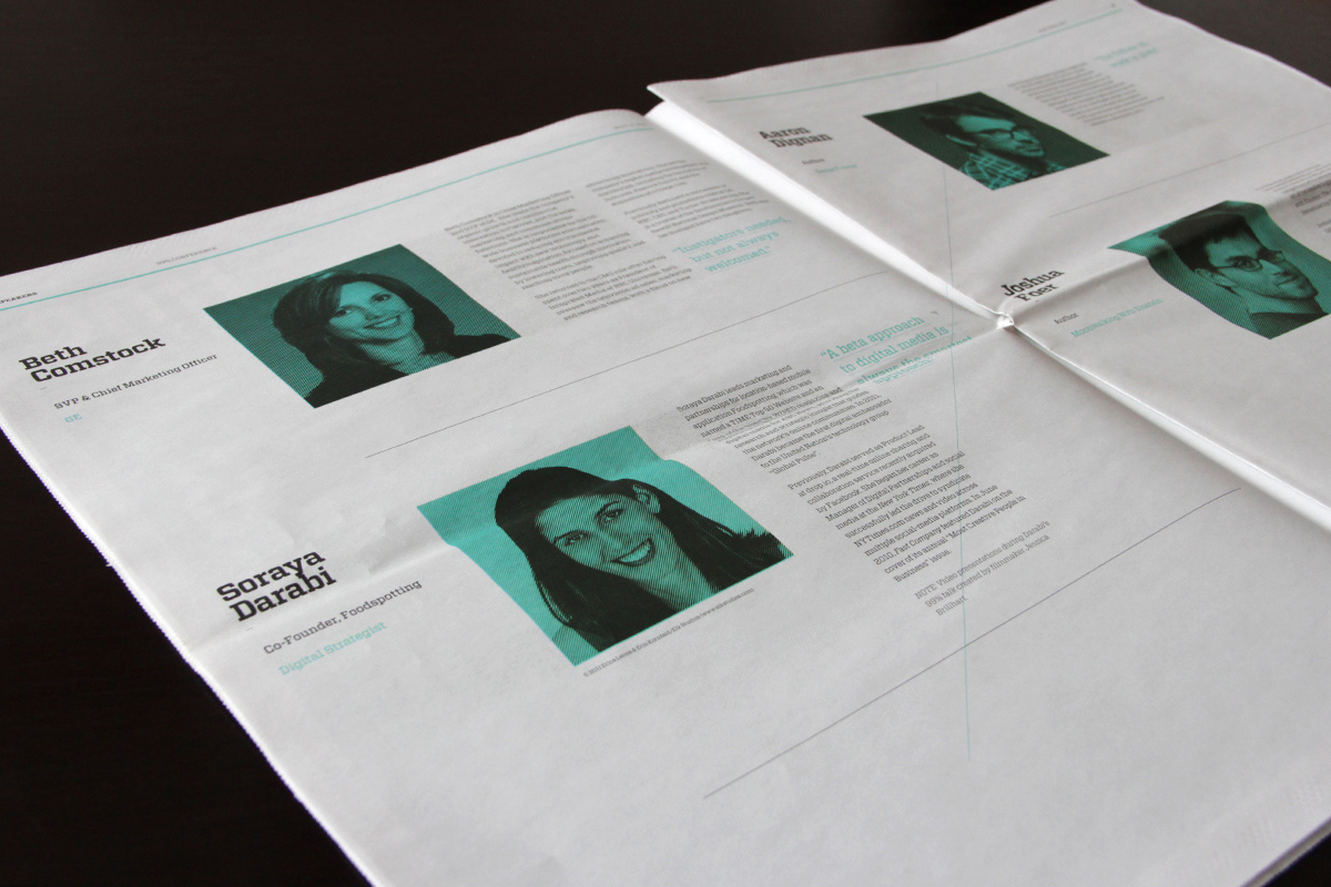
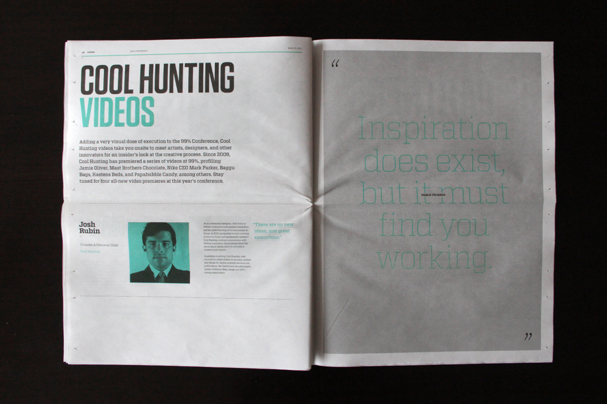
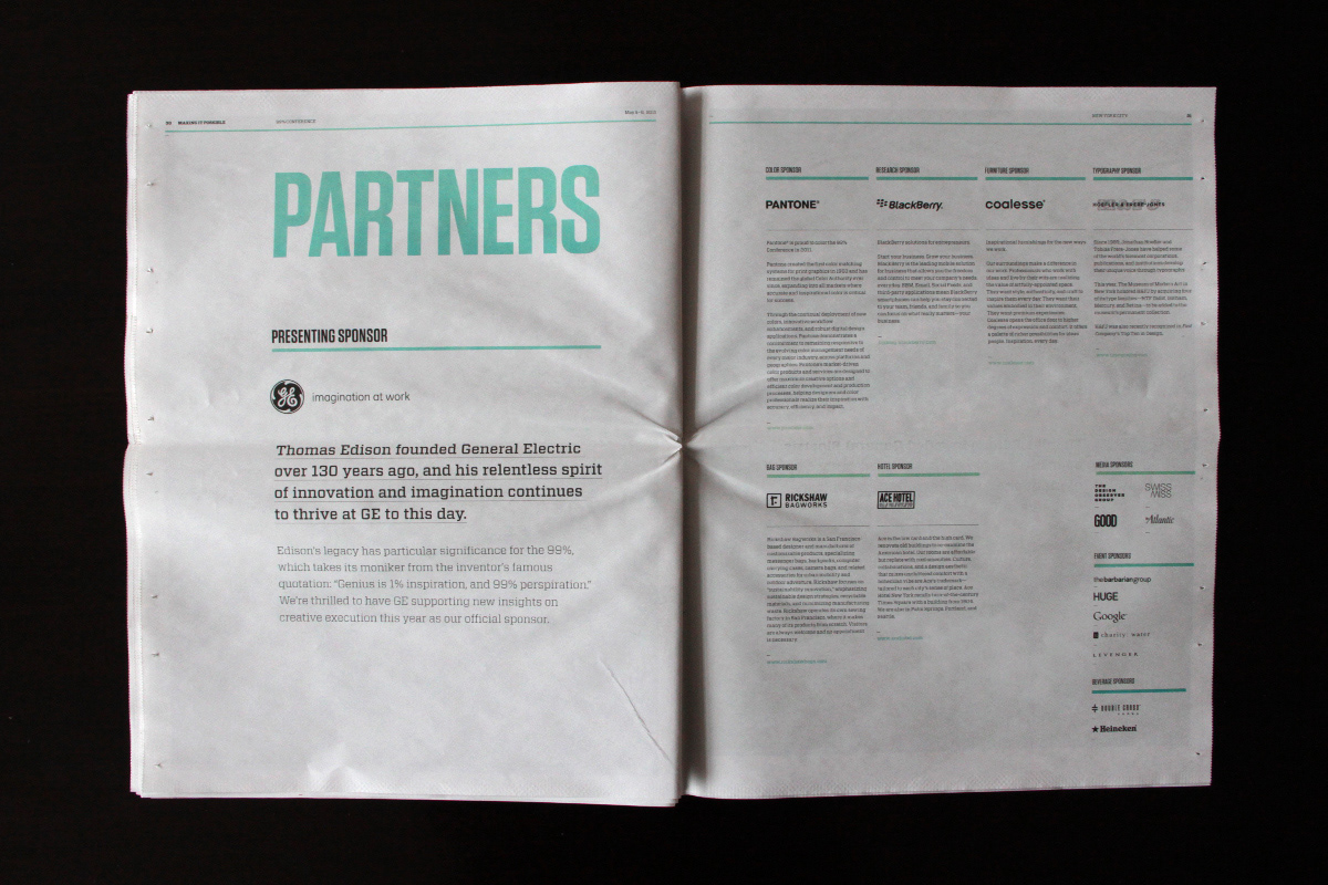
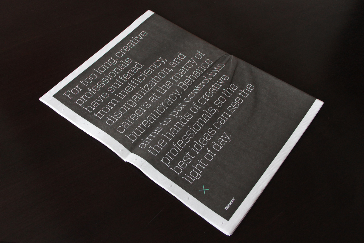
/// The Program
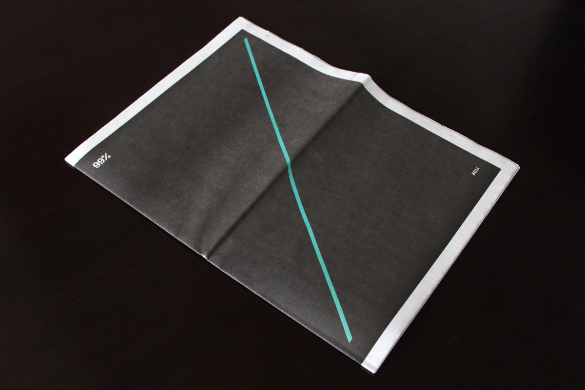
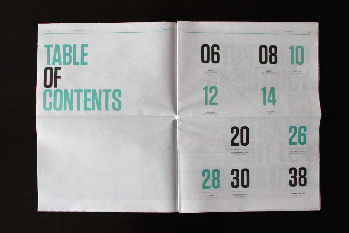
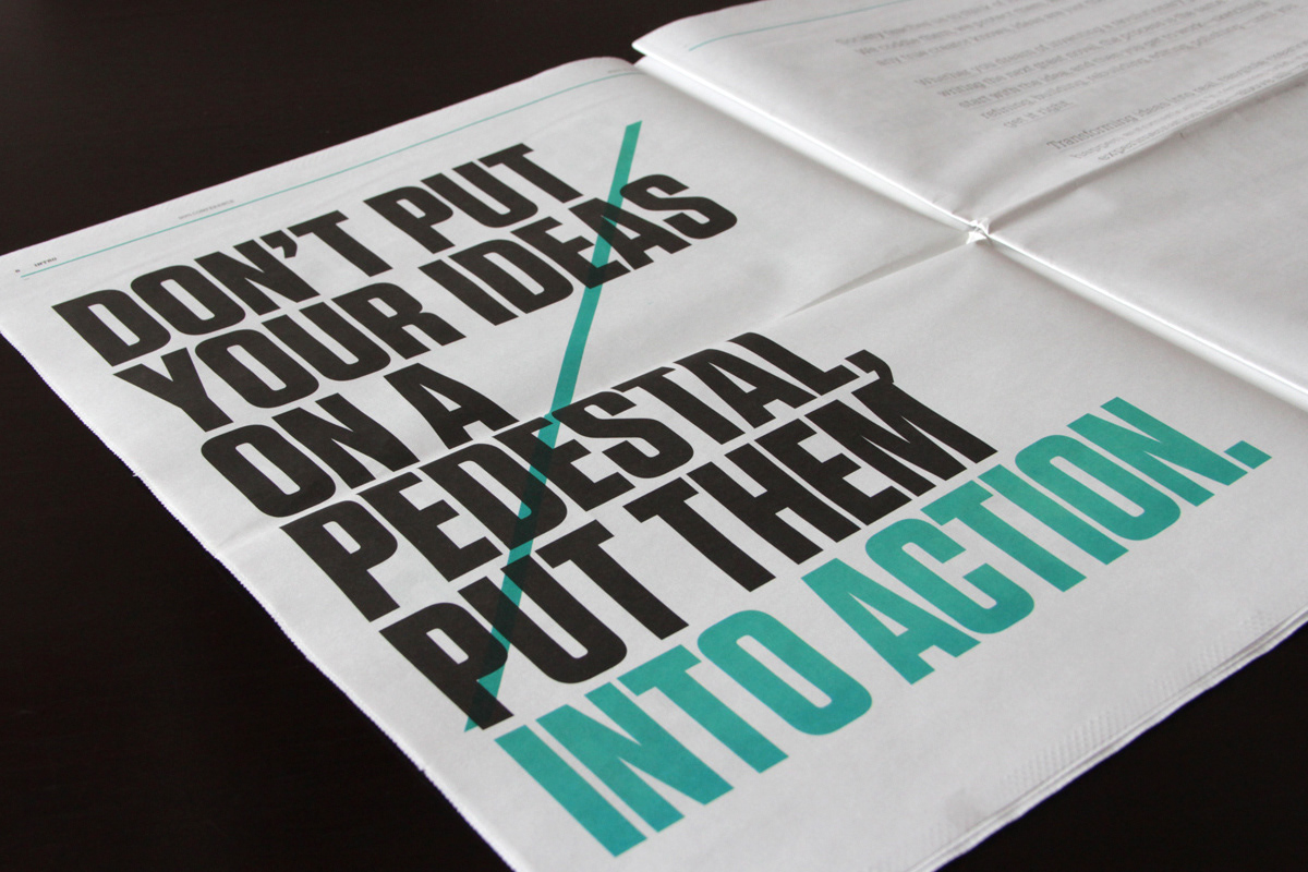
Deciding to go big for 2011, we pumped up our usual 5" x 8" program size to a tabloid-size newspaper, creating spacious layouts with bold typography.
Deciding to go big for 2011, we pumped up our usual 5" x 8" program size to a tabloid-size newspaper, creating spacious layouts with bold typography.


To learn more visit: