99% Conference 2010: Branded Materials
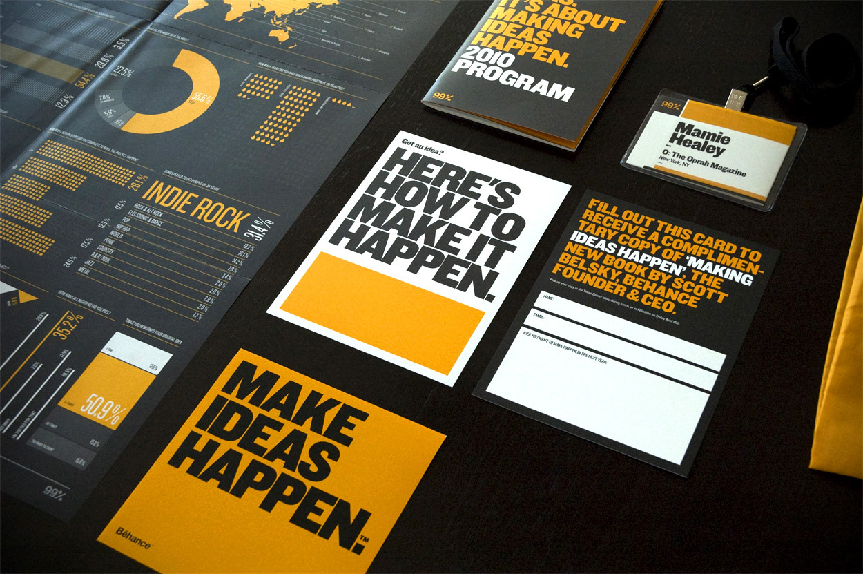
99% Conference 2010 Branding and Materials, all done in house by the Behance design team. Yellow, black and Knockout from Frere-Jones.
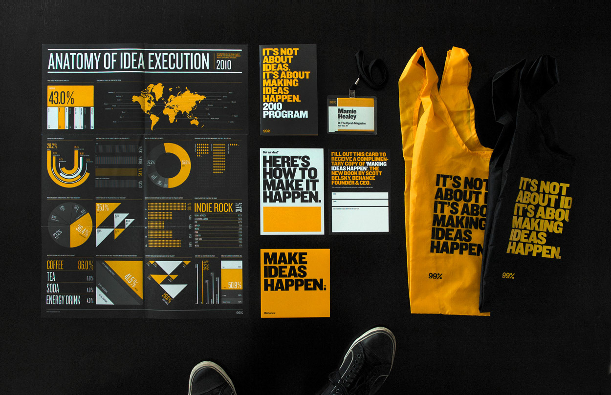
Behance's 99% Conference brings ~450 leading creatives together for two days purely focused on exploring the mechanics of idea execution. Every year, we re-imagine and re-design all of the conference materials to give the event a fresh, dynamic look.
Even though the original brand was pink and gray, we wanted to make every year stand out and have it's own distinct look and feel. We also used Knockout instead of Helvetica Neue to give it a bit more of personality.
—
/// The Intro Reel
Using quotations from our speakers, we built this motion graphics piece, which was played in between presentations. (Motion by Hugh Gran. )
Using quotations from our speakers, we built this motion graphics piece, which was played in between presentations. (Motion by Hugh Gran. )
/// The Poster
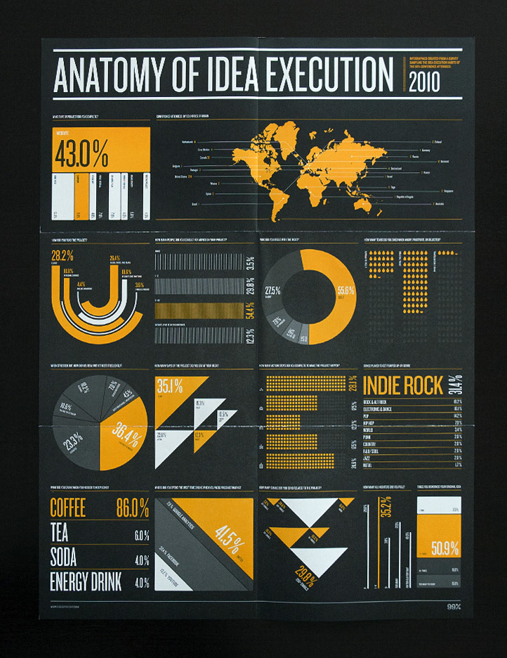
We collected data from the attendees of the conference to build this infographics poster.
We collected data from the attendees of the conference to build this infographics poster.
/// The Goodies
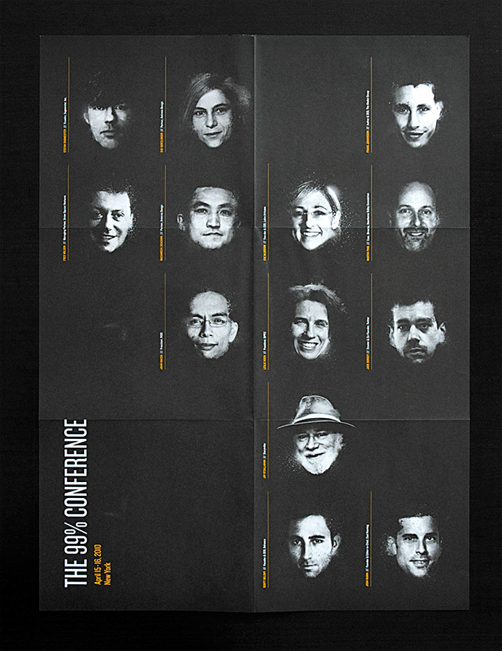
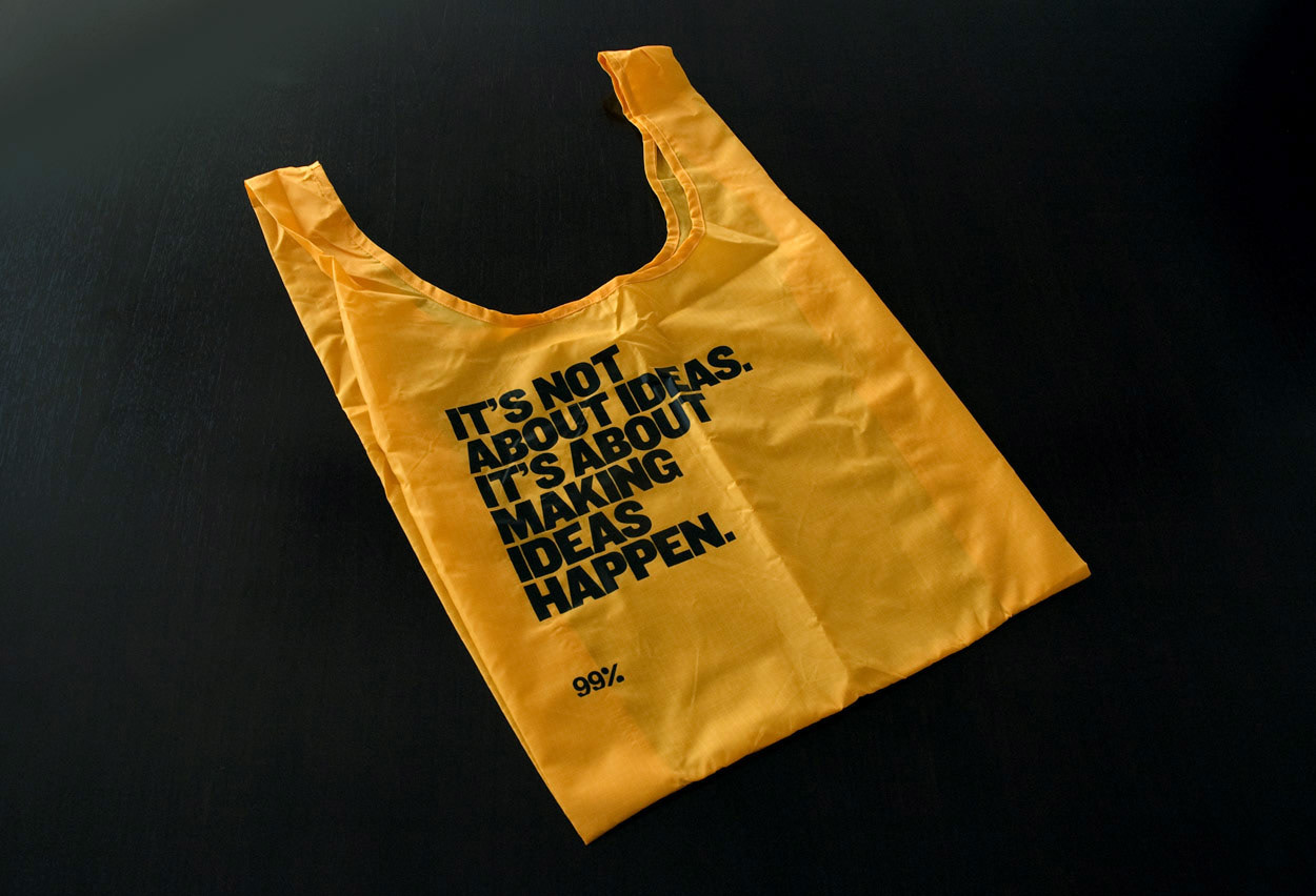
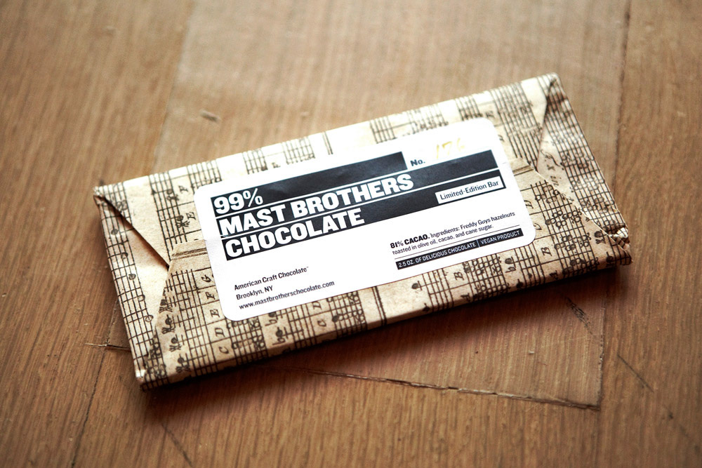
BAGU made our toe bags happen. Resistant, durable and fashionable. Also we partnered with Mast Brothers to bring some bitter sweet chocolate to the Conference. We designed the labels for the numbered 400 chocolate bars they produced.
BAGU made our toe bags happen. Resistant, durable and fashionable. Also we partnered with Mast Brothers to bring some bitter sweet chocolate to the Conference. We designed the labels for the numbered 400 chocolate bars they produced.
/// The Book Give Away Card
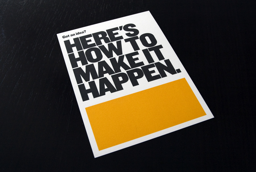
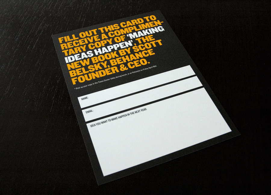
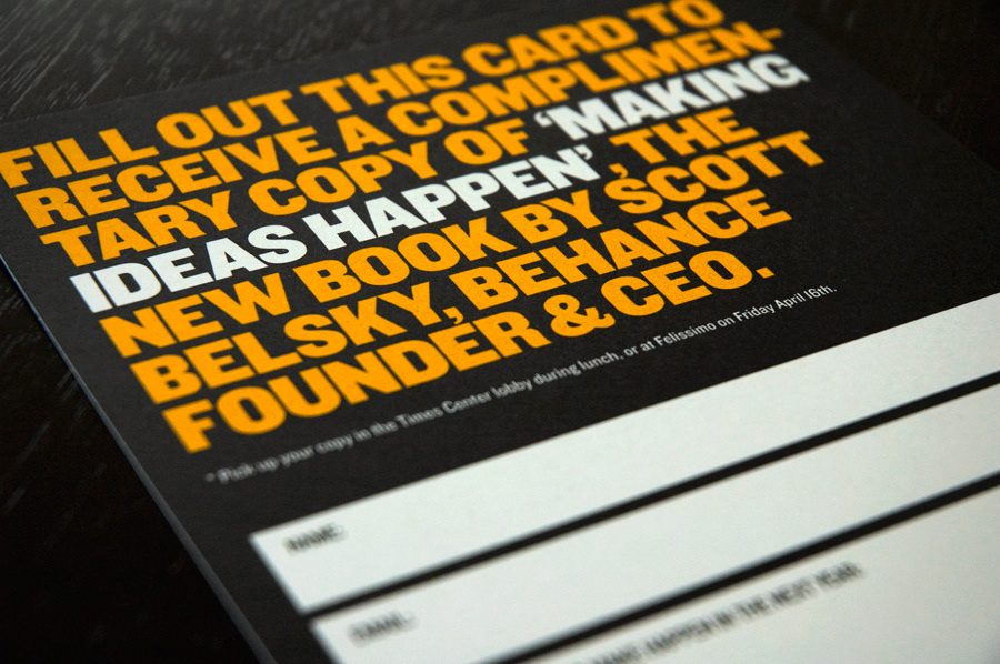
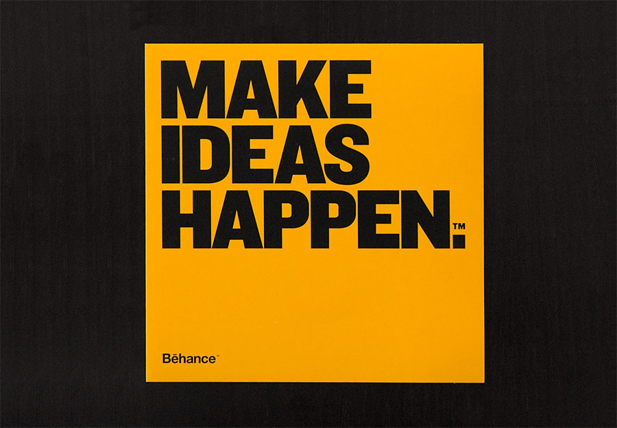
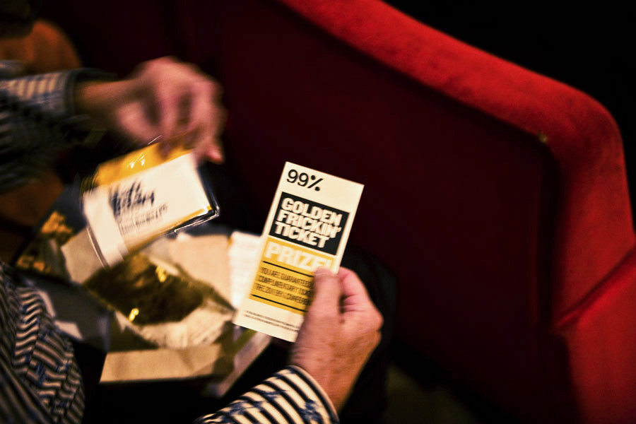
Another giveaway was a copy of Scott Belsky's Book 'Making Ideas Happen'. To receive the book, you fill out this "accountability card" with an idea that you want to make happen. Then we follow up in six months to see how it's going!
Another giveaway was a copy of Scott Belsky's Book 'Making Ideas Happen'. To receive the book, you fill out this "accountability card" with an idea that you want to make happen. Then we follow up in six months to see how it's going!
/// The Brochure
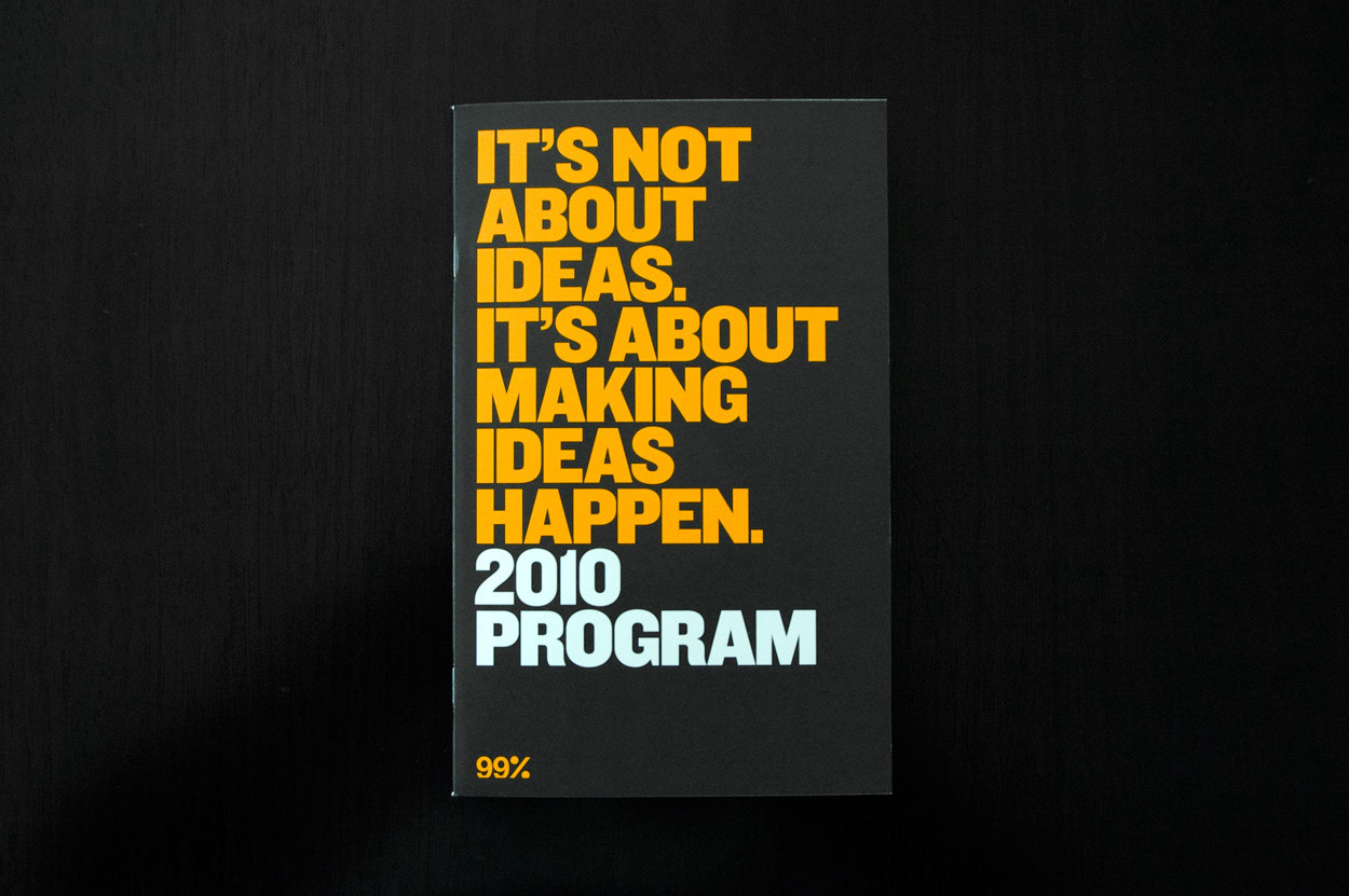
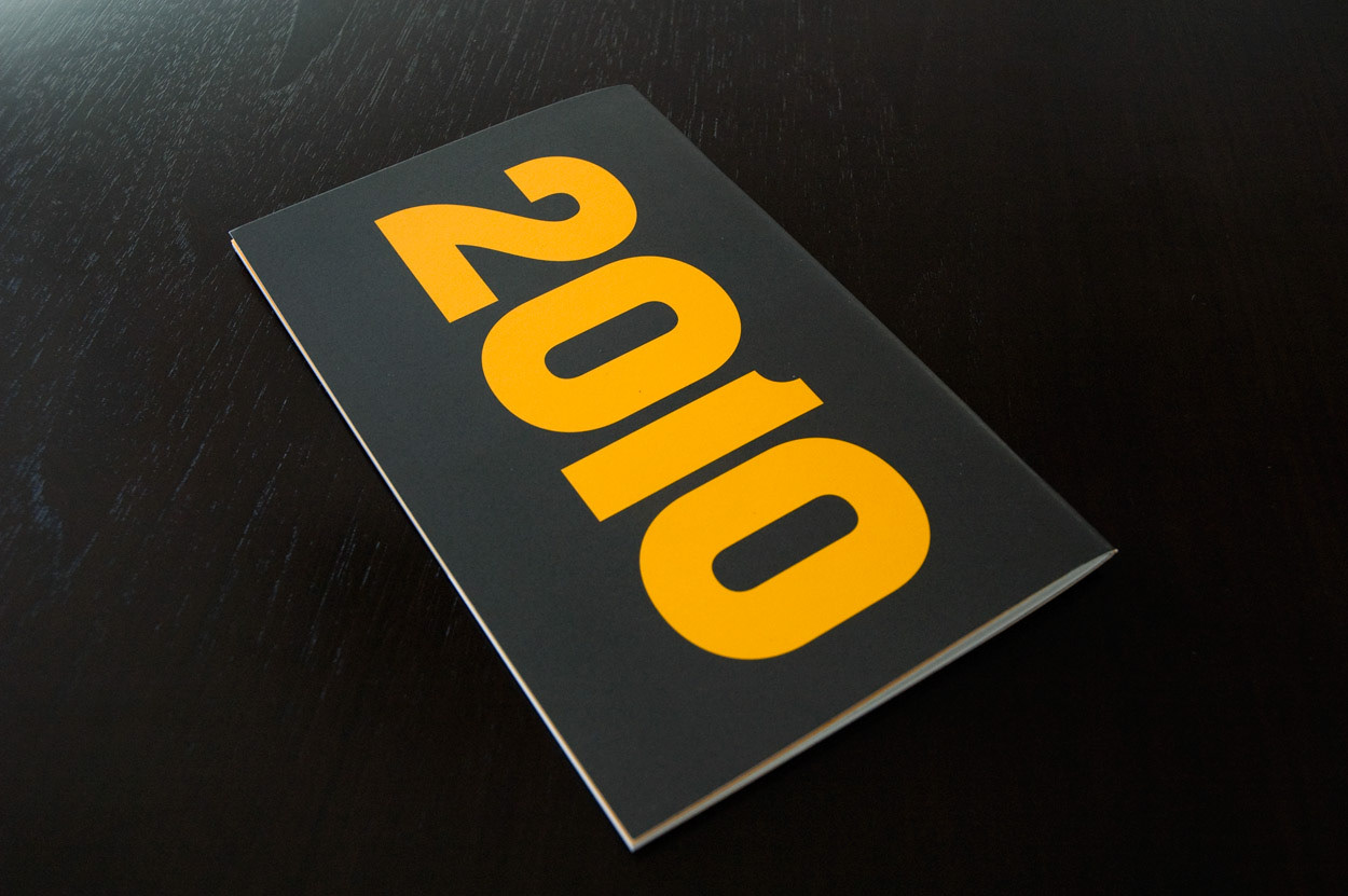
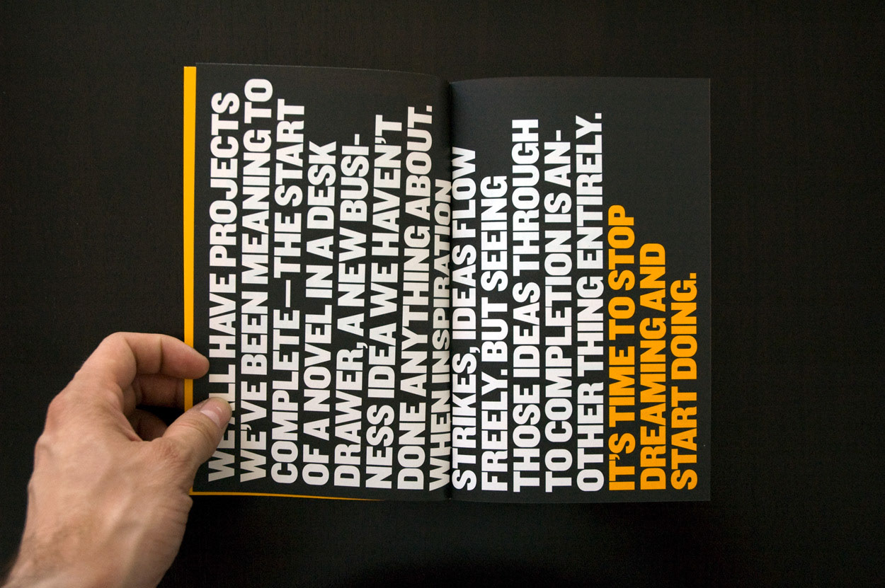
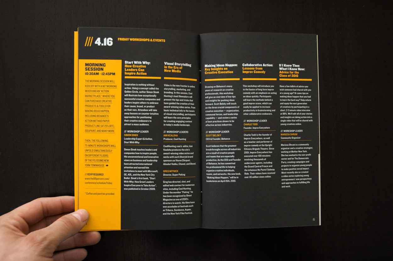
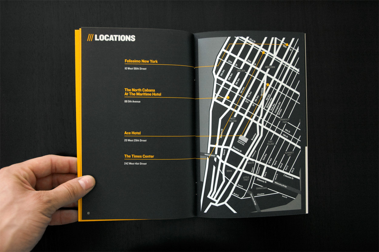
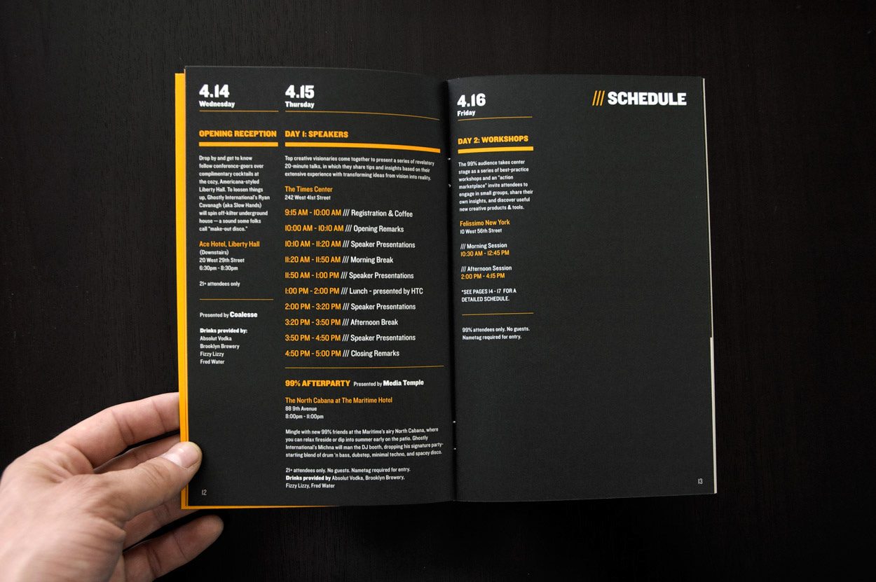
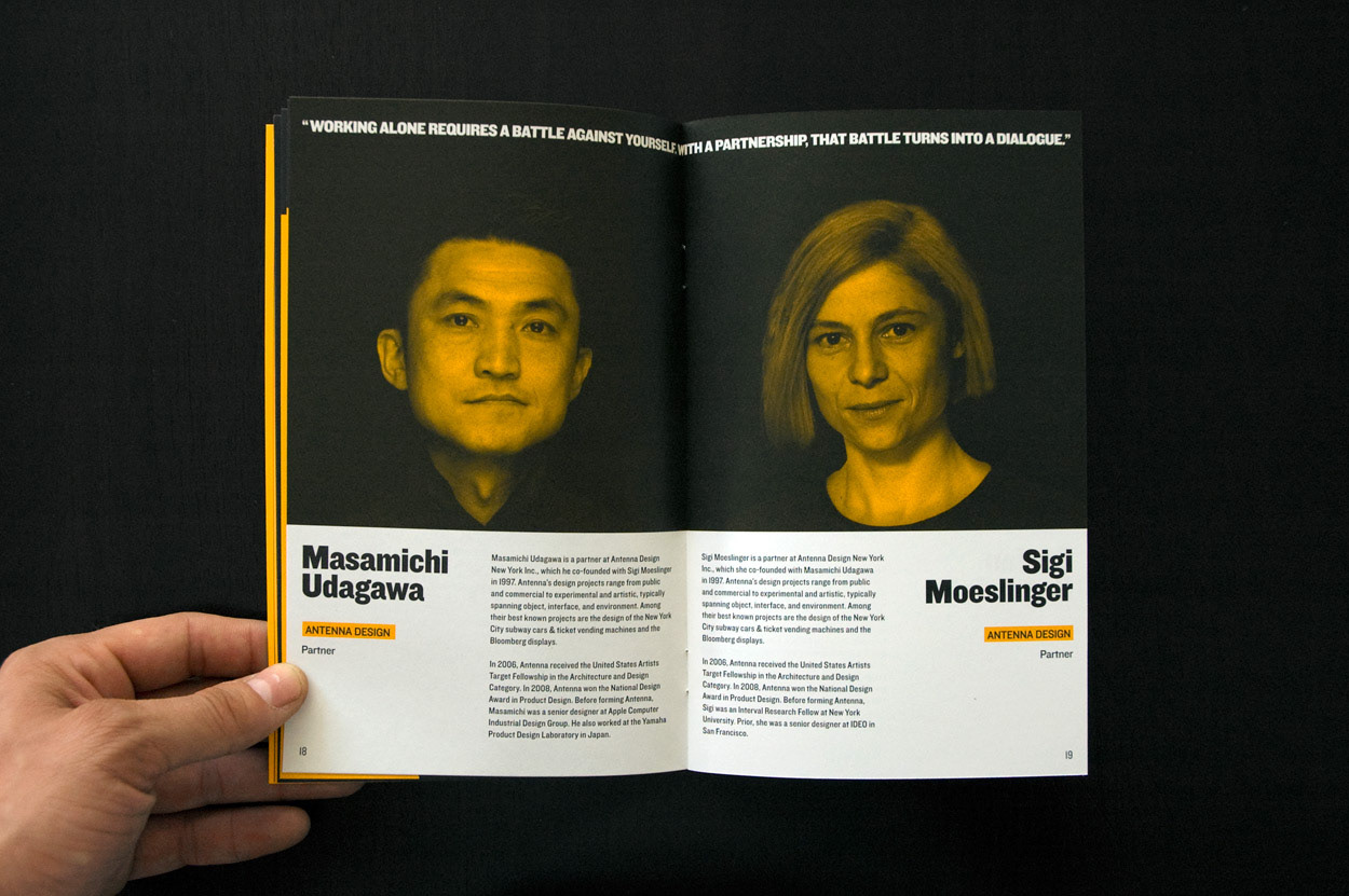
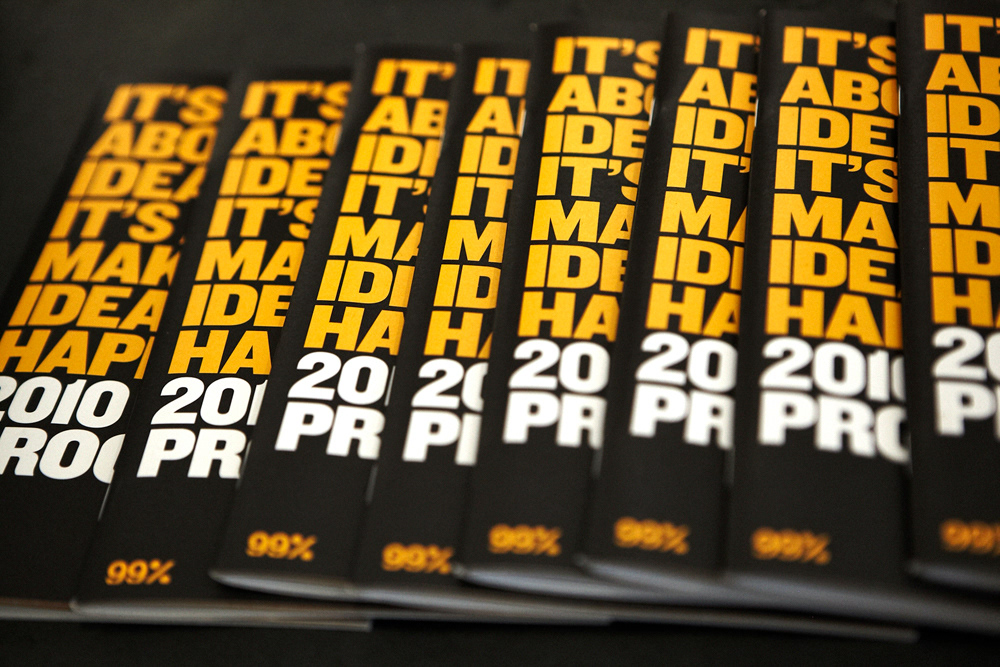
We doubled page size this year and went bolder with the use of full color pages and larger font sizes.
We doubled page size this year and went bolder with the use of full color pages and larger font sizes.


/// The Conference in Pictures
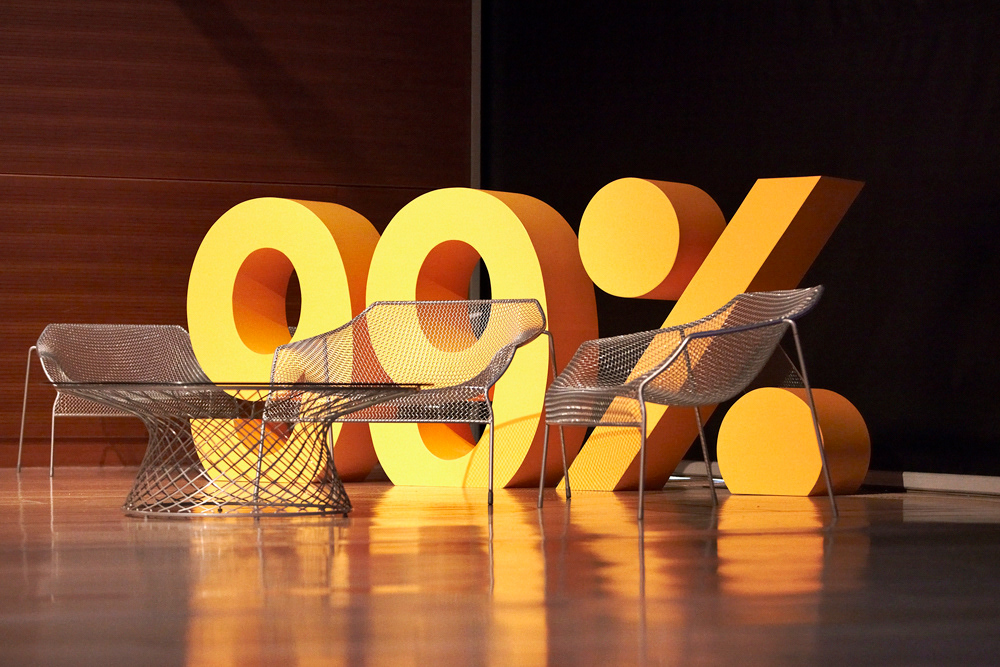
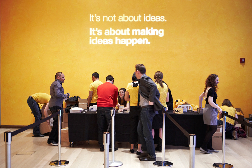
The branding in action...
The branding in action...


To learn more visit: The 99% Website